Preview image. Unlock full-res
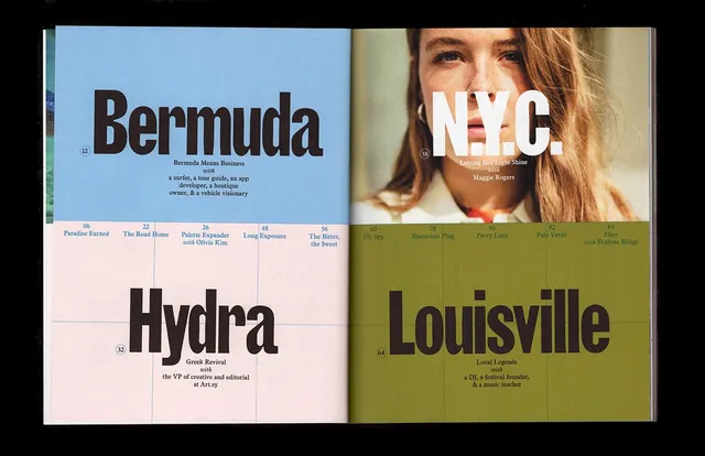
A spread of four gallery guide or exhibition covers with bold serif and sans-serif typography, portrait photography, and structured color blocking.
Summary
A four-panel grid of museum or institution guide covers showing varied typography, portrait photography, and subtly differentiated color blocking in earthy and cool tones.
Visual description
Four separate cover designs are arranged in a 2×2 grid. Each features a large serif or sans-serif title (Bermuda, NYC, Hydra, Louisville) positioned over portrait photography or photography of people. The compositions combine photography, large typography, and color-blocked sections in muted earth tones and cool neutrals. The overall design system feels coherent despite the variety of imagery and titles.
Key takeaway
The effectiveness of a grid-based system combined with consistent typography rules and a restrained color palette to create cohesion across diverse content. Each cover stands alone while belonging to a family.
Reuse notes
Excellent reference for museum, cultural institution, or tourism marketing. The balanced use of large typography, portrait photography, and color blocking creates both authority and approachability. Works well for series design or corporate identity systems.
More like this




Keep what you find
A free account saves references to boards and can send you a weekly email of picks based on what you save.
To see every result, go Pro.