Preview image. Unlock full-res
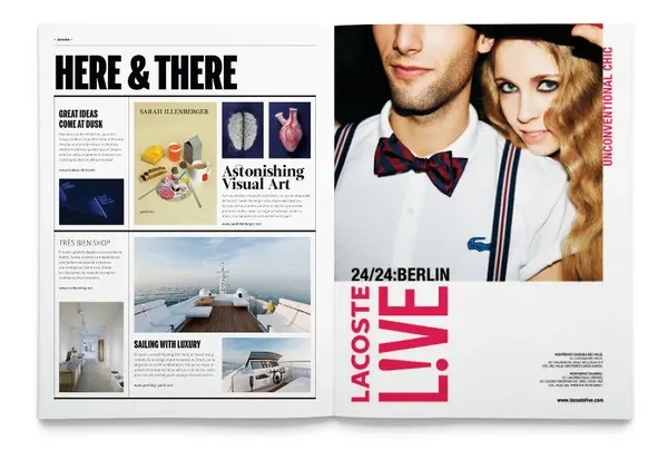
A two-page magazine spread pairing a grid-based editorial layout on the left with a bold typographic cover on the right featuring a couple and '24/24 BERLIN' headline.
Summary
A magazine two-page spread showing a structured editorial grid layout on the left, and a bold typographic composition on the right featuring a lifestyle photograph and '24/24 BERLIN' headline in magenta.
Visual description
Left page: A classic Swiss grid layout with multiple small images arranged in a modular grid pattern (yacht, interior, still-life), accompanied by justified body text in small serif type and section headers. Right page: A bold, modern design with a large photograph of a styled couple, overlaid with massive magenta sans-serif type reading '24/24 BERLIN' and 'LACOSTE LIVE' branding at bottom. The two pages show contrasting approaches: rational gridded information versus bold image-led typography.
Key takeaway
Pairing restrained systematic layouts with bold emotional typography on facing pages creates dynamic narrative rhythm within a single spread.
Reuse notes
Strong reference for magazine redesigns, lifestyle editorial, and demonstrations of how grid and expressive type can work in dialogue on a spread.
More like this

Keep what you find
A free account saves references to boards and can send you a weekly email of picks based on what you save.
To see every result, go Pro.