Preview image. Unlock full-res
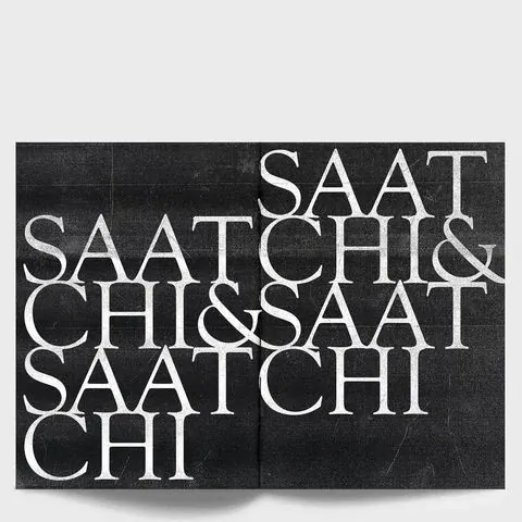
Monochrome editorial spread stacking fragmented SAATCHI and SAATCHI name in high-contrast serif type.

Summary
A double-page spread repeats and interlocks SAATCHI and SAATCHI in white serif caps on a grainy black field.
Visual description
High-contrast Bodoni-like letterforms overlap in tight rows, breaking across lines so counters interlock. A subtle center fold divides the spread. Photocopied texture adds flecks and scratches across the black ground.
Key takeaway
Fragmenting a famous name into dense typographic texture turns legibility into pattern.
Reuse notes
Useful for agency anniversary books, editorial covers, or monochrome identity explorations.
More like this



Keep what you find
A free account saves references to boards and can send you a weekly email of picks based on what you save.
To see every result, go Pro.