
Preview image. Unlock full-res
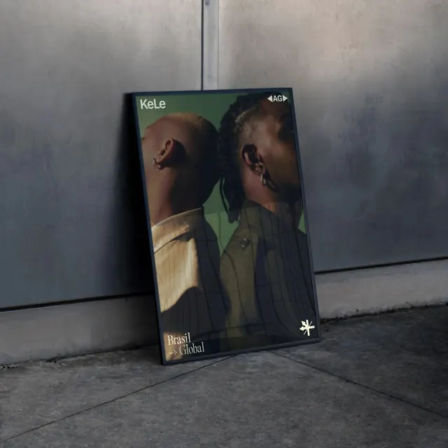
Brand campaign or product showcase for Adidas Originals with muted sage green palette and minimalist layout.
Summary
A contemporary Adidas Originals design using a refined sage green color palette with product photography and clean typography in a premium, lifestyle-focused layout.
Visual description
Soft sage green and muted gray-green tones dominate the color field. Product photography (likely apparel, footwear, or accessories) sits in a clearly defined space with careful negative space around it. Type appears in clean sans-serif, likely the Adidas house font. Text is minimal—probably the brand name, product name, and a brief tagline. The composition balances the product image with breathing room; no overcrowding. The overall palette is sophisticated and gender-neutral, leaning into contemporary minimal aesthetic rather than high-contrast sport energy.
Key takeaway
Brand color refinement. Moving away from Adidas' traditional bold blacks and whites into muted earth tones (sage, taupe) modernizes the brand's perception without losing recognition. This is how established heritage brands refresh without a rebrand.
Reuse notes
Strong reference for sportswear/apparel branding moving into lifestyle positioning. The muted green palette is on-trend and works well for sustainability messaging (even if not explicit). Good study in balancing a strong brand identity (the Adidas wordmark, three stripes if present) with contemporary soft color palettes. Note how product photography doesn't fight the color story—the product placement supports rather than dominates.
More like this






Keep what you find
A free account saves references to boards and can send you a weekly email of picks based on what you save.
To see every result, go Pro.