Preview image. Unlock full-res
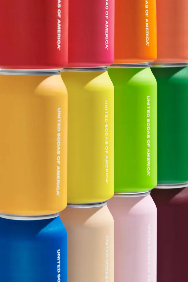
Full-spectrum soda can lineup showing bold jewel-tone colors with minimalist white text labeling against studio background.
Summary
A striking lineup of soda cans spanning a full spectrum of bold colors—gold, red, orange, yellow, green, blue, pink, maroon—each minimally labeled with white condensed sans-serif text running vertically down the can.
Visual description
Eight cylindrical cans arranged in a grid against a neutral background, each pure saturated color creating a rainbow progression. White text runs vertically down each can with the branding name. The cans are lit to show their cylindrical volume and reflective surfaces, and metal rims catch light at the top of each can.
Key takeaway
A single unified color palette is the strongest branding tool—letting color do all the work while text stays minimal and consistent creates instant visual cohesion.
Reuse notes
Essential reference for beverage or consumer-goods branding where color is the primary differentiator. Works for any product family where you want to convey a complete range at a glance.