Preview image. Unlock full-res
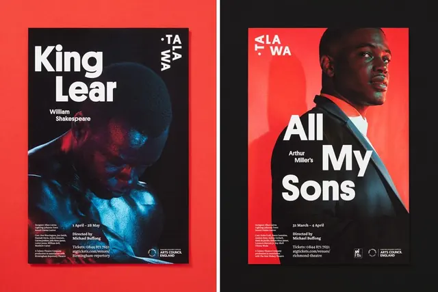
Two theater production posters using a bold split-screen layout with bright red and cool dark backgrounds, large typography, and actor portraits.
Summary
Two theater promotion posters using a striking split-color composition (bright red left, dark navy/black right) with large white typography, actor portraits, and production credits.
Visual description
Left poster: Bright neon-red background. A portrait of a face (appearing aged, with dramatic lighting) occupies the right half, photographed in duotone against a dark background and blue-tinted overlay. White all-caps sans-serif text reads "King Lear" with "William Shakespeare" smaller below. Small white condensed lowercase text lists credits and dates at the bottom. A vertical black and white label rotated reads "TAWA". Right poster: Similar structure but with bright red background and a different actor's portrait (male, facing left). White text reads "All My Sons" with "Arthur Miller's" attribution. Same credit bar at bottom. Both posters use consistent typography, layout proportions, and branding elements (Arts Council England logo visible). The red and dark color scheme creates high visual impact and ensures legibility from distance.
Key takeaway
The split-color composition creates visual drama without relying on image complexity. High contrast red and black is attention-grabbing and signals urgency/importance. The consistent use of typography as the primary design element (actor portraits secondary) makes the work portable and scalable.
Reuse notes
Strong pattern for event promotion, theater, film, performance venues, or any brand wanting bold, high-impact graphics. The red and black combo is striking but may feel aggressive; test on diverse audiences. The portrait treatment (duotone, positioned off-center) allows for flexible casting/talent substitution without layout changes. Works well at small scale (social media) and large scale (outdoor signage).