Preview image. Unlock full-res
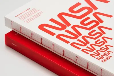
A high-angle close-up of two stacked books featuring a repetitive red NASA wordmark pattern on a white cover and a solid red spine.
Summary
A high-angle close-up of two stacked books featuring a repetitive red NASA wordmark pattern on a white cover and a solid red spine.
Visual description
The white book cover features a large-scale, repeating red NASA wordmark pattern that wraps around the edges. Below the pattern, a block of small sans-serif text discusses reproduction rights. The book rests on a solid red book with 'The NASA' visible on the spine.
Key takeaway
Using oversized, repeating typography as a primary graphic pattern can create a strong brand identity.
Reuse notes
Use this approach when designing brand guidelines or coffee table books that need a high-impact visual identity.
More like this

Keep what you find
A free account saves references to boards and can send you a weekly email of picks based on what you save.
To see every result, go Pro.