Preview image. Unlock full-res
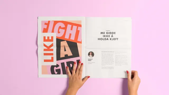
An open magazine spread featuring a high-contrast typographic left page and a clean, text-heavy right page held by two hands against a pink background.
Summary
An open magazine spread featuring a high-contrast typographic left page and a clean, text-heavy right page held by two hands against a pink background.
Visual description
The left page features oversized, overlapping sans-serif text reading 'FIGHT LIKE A GIRL' in coral, white, and black blocks. The right page contains a clean layout with the headline 'ME GIDDE IKKE Å HOLDA KJEFT' and a small circular portrait of Nancy Perez. The entire spread is held by hands with red nail polish against a solid pink backdrop.
Key takeaway
Use oversized, blocky typography on one side of a spread to create a high-impact visual anchor that balances a minimalist, text-driven opposite page.
Reuse notes
Use this layout for magazine features, posters, or social media carousels where you need to balance a strong graphic statement with readable body text.
More like this
Keep what you find
A free account saves references to boards and can send you a weekly email of picks based on what you save.
To see every result, go Pro.