Preview image. Unlock full-res
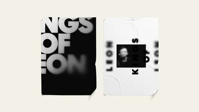
A book cover or poster design featuring large-scale typography ("THE KING OF LEON" / "KRZYSZTOF"), rendered in bold sans-serif faces with a subtle photographic background showing a figure in minimal detail.
Summary
A striking typographic book cover or poster where bold, oversized all-caps typography ("THE KING OF LEON" / "KRZYSZTOF") dominates a subtly photographic background, prioritizing text hierarchy and legibility over imagery.
Visual description
The composition is approximately 70% typography and 30% background. Large sans-serif letters in white and warm cream fill the upper and right portions of the space, spelling out title text in all-caps with generous letter-spacing. The typography has strong weight variation, with certain words appearing bolder or larger than others, creating visual rhythm. The background is a muted photograph showing what appears to be a human figure or form in desaturated browns and grays, completely subordinated to the text. The overall palette is warm-monochromatic (creams, taupes, dark browns) with minimal color contrast. The layout is asymmetric but balanced.
Key takeaway
Typography is treated as a primary design element, not merely a label applied to imagery. The background photograph serves as subtle texture rather than focal point. The generous letter-spacing and scale ensure legibility at any size while creating visual sophistication. The warm monochromatic approach unifies type and image without them competing.
Reuse notes
Excellent template for literary, publishing, and cultural projects prioritizing textual content. The approach works well for book covers, exhibition posters, and editorial spreads. The technique requires confident typography choices and clear visual hierarchy. Best with serif or geometric sans-serif faces that have distinctive character. The subtle background photograph is a sophisticated touch but requires careful image selection—low-saturation, minimal subject detail prevents visual competition. This approach can feel overly restrained in commercial contexts; reserves it for introspective or artistic briefs. Strong for portfolios and case studies demonstrating typographic mastery.