Preview image. Unlock full-res
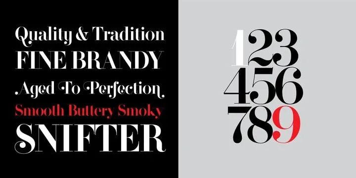
Split-panel type specimen showing a high-contrast didone serif in roman, italic, and small caps beside oversized numerals with a single red accent.
Summary
A two-panel specimen for a high-contrast didone display serif: sample phrases on black at left, a large stacked numeral set 1 through 9 on gray at right.
Visual description
The left half is solid black with five left-aligned sample lines in white, one in red: "Quality & Tradition" in title case, "FINE BRANDY" in spaced caps, "Aged To Perfection" in swash italic, "Smooth Buttery Smoky" in red italic, and "SNIFTER" oversized with a looping descender. The right half is flat light gray carrying the numerals 1-9 in three dense rows of extreme thick-thin didone figures, all black except a red 9. Hairline serifs and ball terminals show throughout.
Key takeaway
Specimen design as contrast theater: black and gray panels split text setting from numerals, and a single red word plus a single red figure guide the eye through an otherwise monochrome layout. Evocative sample copy (brandy tasting notes) sells the typeface's luxury voice.
Reuse notes
A model for typeface marketing pages, font-pairing boards, and luxury brand type explorations. The one-red-element trick transfers to any monochrome editorial layout. Didone hairlines need large sizes and high-resolution output; avoid small body settings.
More like this
Keep what you find
A free account saves references to boards and can send you a weekly email of picks based on what you save.
To see every result, go Pro.