Preview image. Unlock full-res
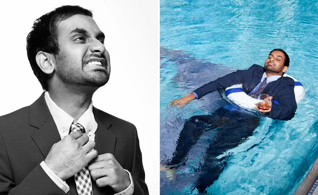
A diptych featuring two photographs of the same man in a suit: a black and white close-up with a strained expression, and a color shot of him floating in a pool with a drink.
Summary
A diptych featuring two photographs of the same man in a suit: a black and white close-up with a strained expression, and a color shot of him floating in a pool with a drink.
Visual description
The image is split vertically. On the left, a high-contrast monochrome close-up shows a man in a suit looking upward with a grimacing expression. On the right, a color photograph shows the same man in a suit floating in a blue swimming pool, holding a glass and looking relaxed.
Key takeaway
Use a split-screen layout to create a direct visual juxtaposition between two contrasting states or emotions.
Reuse notes
Use this layout for 'before and after' comparisons or to highlight a dramatic shift in character or mood.
More like this
Keep what you find
A free account saves references to boards and can send you a weekly email of picks based on what you save.
To see every result, go Pro.