Preview image. Unlock full-res
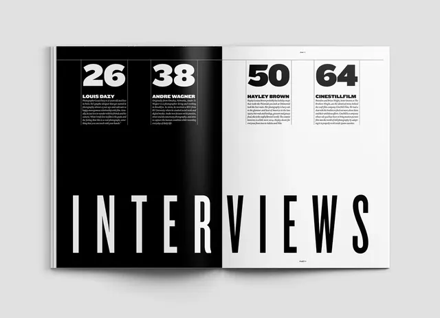
A high-contrast, two-page magazine spread featuring a table of contents for an 'INTERVIEWS' section, utilizing large numeric indices and bold typography.
Summary
A high-contrast, two-page magazine spread featuring a table of contents for an 'INTERVIEWS' section, utilizing large numeric indices and bold typography.
Visual description
The layout uses a stark black-and-white split across two pages. Large, bold sans-serif numbers (26, 38, 50, 64) act as anchors for text blocks, while the word 'INTERVIEWS' is rendered in massive, oversized all-caps type at the bottom of the spread.
Key takeaway
Use extreme typographic scale and high-contrast color blocking to create a clear visual hierarchy and immediate impact.
Reuse notes
Ideal for magazine table of contents, lookbooks, or portfolio landing pages where bold identity is required.
More like this
Keep what you find
A free account saves references to boards and can send you a weekly email of picks based on what you save.
To see every result, go Pro.