Preview image. Unlock full-res
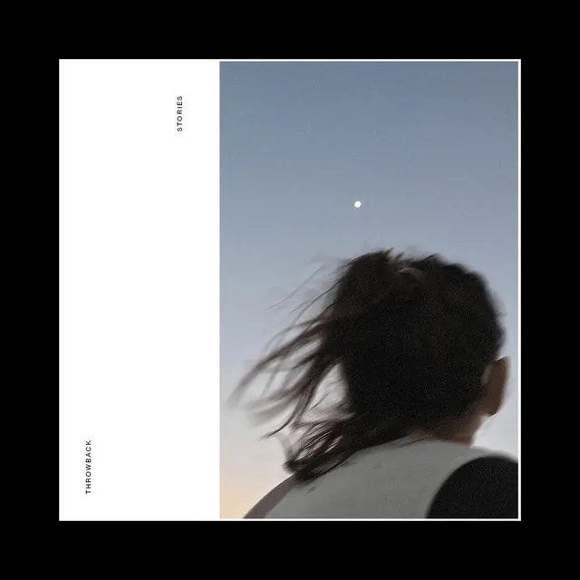
A split-page magazine or portfolio layout with "Stories" and "Throwback" text on a white left side and a silhouetted figure with wind-swept hair against a blue-grey sky on the right.
Summary
A magazine editorial spread dividing content and imagery: clean text-heavy left column labeled "Stories" and "Throwback" contrasts with a cinematic silhouette of a figure photographed against a blue sky with wind-blown hair.
Visual description
The left third is pure white with vertical sans-serif text rotated ninety degrees: "STORIES" and "THROWBACK" stacked, creating a quiet visual pause. The right two-thirds is a photograph of a person shown from shoulders-up in silhouette, head tilted back, their long dark hair wind-swept across the frame. A distant moon or sun appears in the light blue-grey sky. The contrast is striking: minimal typography + generous whitespace versus rich, atmospheric portraiture. No drop shadows or effects—just pure division.
Key takeaway
Using negative space and typography as design elements on one side of a spread gives the photography on the other side room to breathe. Silhouette simplifies portraiture to shape and mood. The vertical text creates a visual weight that balances the prominent human figure without competing with it.
Reuse notes
Reference for editorial layouts, magazine spreads, or portfolio presentations where image needs to be the hero. Works well for lifestyle, personal essays, or retrospective content. The silhouette technique is timeless and works across industries—editorial, fashion, wellness. The two-column proportional split (1:2) is easy to adapt. Notably effective when the photography has emotional or cinematic weight and minimal text is required.
More like this
Keep what you find
A free account saves references to boards and can send you a weekly email of picks based on what you save.
To see every result, go Pro.