Preview image. Unlock full-res
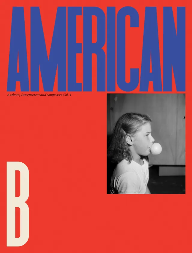
A high-contrast graphic poster featuring oversized blue typography on a red background with a black and white photographic inset of a girl blowing a bubble.
Summary
A high-contrast graphic poster featuring oversized blue typography on a red background with a black and white photographic inset of a girl blowing a bubble.
Visual description
The design features a massive, condensed blue 'AMERICAN' wordmark at the top and a large white 'B' at the bottom left against a solid red field. A rectangular black and white photograph of a girl blowing a bubble is positioned on the right side. The layout uses extreme scale differences between the typography and the photographic element.
Key takeaway
Use extreme typographic scale and high-contrast color blocking to create immediate visual impact.
Reuse notes
Ideal for magazine covers, event posters, or bold brand identities that require a striking, graphic presence.