Preview image. Unlock full-res
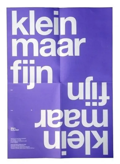
Colorful Dutch-language poster with bold sans-serif typography in white on a vibrant purple background.
Summary
Vibrant purple poster with overlapping white sans-serif text reading "klein maar fijn" (small but fine), accompanied by additional Dutch text and small graphic elements in the lower corner.
Visual description
Bold, chunky sans-serif letterforms in pure white are arranged in an overlapping, staggered layout across a rich violet background. The composition is dynamic, with text rotated and positioned at varied angles. Small credits and additional text appear in the lower left corner. The color contrast is stark and high-energy, creating visual impact through simplicity.
Key takeaway
Overlapping, rotated typography on a bold monochromatic background achieves dynamism and visual interest through composition alone, without ornament or complexity.
Reuse notes
Strong approach for Dutch design aesthetic, cultural posters, or any context where energetic, playful typography needs to command attention within tight color constraints.