Preview image. Unlock full-res
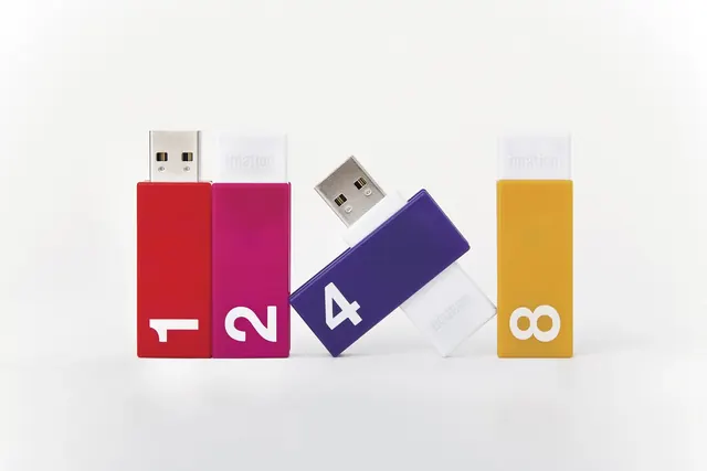
A collection of four colorful USB flash drives arranged in a sequence, featuring large white numbers on their bodies.
Summary
A collection of four colorful USB flash drives arranged in a sequence, featuring large white numbers on their bodies.
Visual description
Four USB drives in red, pink, purple, and yellow are arranged against a plain white background. Each drive features a large, white, sans-serif number (1, 2, 4, and 8) centered on its body. The drives are positioned vertically or at an angle to create a sense of progression.
Key takeaway
Using high-contrast, large-scale typography on colorful objects can create a clear, playful sense of order and sequence.
Reuse notes
Use this approach when photographing a product line that needs to be clearly categorized or sequenced for a consumer audience.
More like this

Keep what you find
A free account saves references to boards and can send you a weekly email of picks based on what you save.
To see every result, go Pro.