Preview image. Unlock full-res
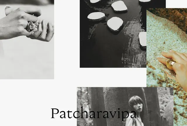
Photographic grid for jewelry brand Patcharavipa featuring black-and-white and color images of hands, rings, natural elements, and a portrait, with large serif wordmark at bottom.
Summary
A photographic collage layout for jewelry brand Patcharavipa, mixing black-and-white and color imagery of hands wearing rings, natural textures, and portraiture, anchored by a large serif wordmark.
Visual description
Asymmetric grid layout combining photographs of varying scales. Top-left shows a black-and-white close-up of hands wearing an ornate ring against white. Top-center features white stone/gem elements on dark water or textured surface in black-and-white. Top-right displays a color photograph of a gold ring on a turquoise textured background, introducing warm and cool tones. Lower section contains a black-and-white portrait of a woman in dark clothing among foliage. The large serif wordmark "Patcharavipa" anchors the bottom in black typography. Composition blends photography with generous white space and careful attention to visual rhythm across the grid.
Key takeaway
Jewelry branding can use photography of the hands, materials, and wearer rather than isolated product shots, creating emotional narrative and lifestyle context. The serif wordmark provides typographic sophistication and contrast to the photographic content.
Reuse notes
Excellent reference for luxury jewelry or accessories branding. Works well for portfolio pieces, editorial features, or campaign spreads where telling a story through diverse imagery matters more than consistent tone. The mix of black-and-white and color photography suggests craftsmanship and human connection. Pairs well with serif typography and asymmetric grid layouts.
More like this



Keep what you find
A free account saves references to boards and can send you a weekly email of picks based on what you save.
To see every result, go Pro.