Preview image. Unlock full-res
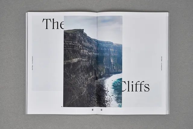
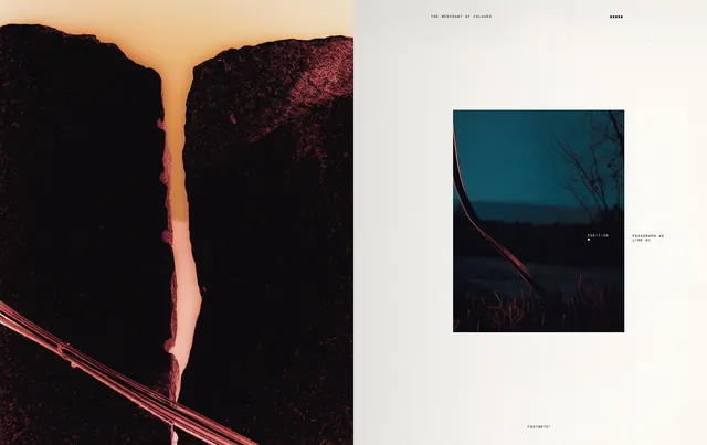
Double-page editorial layout featuring a dramatic cliff and turquoise water landscape photograph with serif headline and minimal typography treatment.
Summary
An elegant editorial double-page spread featuring the words "The" and "Cliffs" in a classic serif display typeface, with a dramatic full-color photograph of rocky cliffs and turquoise water positioned between the text on an otherwise minimal white background.
Visual description
The composition is a white double-page spread with generous margins. The headline "The" appears top-left in a serif display font, while "Cliffs" is positioned bottom-right, allowing the large landscape photograph to occupy the center and break between the two words. The photograph shows dark rocky cliff faces with striking turquoise water visible below, shot from a high vantage point. Small page numbers and credit text sit in the bottom corner. The overall treatment is restrained and elegant, allowing the landscape image to command attention while the typography provides narrative context.
Key takeaway
Masterful use of asymmetric typography to frame and emphasize a central image. The split headline creates natural reading flow around the photograph rather than competing with it. White space and minimal supporting elements create sophistication without coldness. This is editorial grid design at its most refined.
Reuse notes
Strong reference for magazine layouts, editorial design, or luxury print publications. Works well for travel, lifestyle, or cultural contexts where landscape/nature imagery is central. The serif typeface adds editorial credibility and elegance. The split-text technique is highly replicable and effective across many content types. The cool nature palette suggests mountain, water, or northern-landscape subject matter, but the principle applies more broadly.
More like this

Keep what you find
A free account saves references to boards and can send you a weekly email of picks based on what you save.
To see every result, go Pro.