Preview image. Unlock full-res
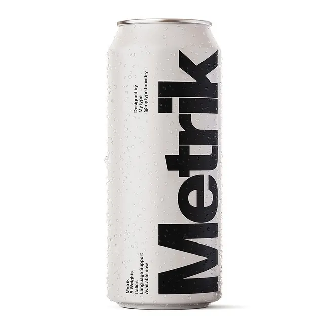
A typographic specimen displayed on a condensation-covered aluminum can, showcasing the 'Metrik' typeface.
Summary
A typographic specimen displayed on a condensation-covered aluminum can, showcasing the 'Metrik' typeface.
Visual description
A vertical aluminum can covered in water droplets features a large, black, oversized 'Metrik' wordmark running vertically. Smaller technical text details the font's features, such as '5 Weights', 'Italics', and 'Language Support', arranged in small blocks on the side.
Key takeaway
Using oversized, condensed typography on a product mockup creates a high-impact, modern typographic specimen.
Reuse notes
Use this approach when presenting a new typeface through realistic, high-contrast product applications.
More like this
Keep what you find
A free account saves references to boards and can send you a weekly email of picks based on what you save.
To see every result, go Pro.