Preview image. Unlock full-res
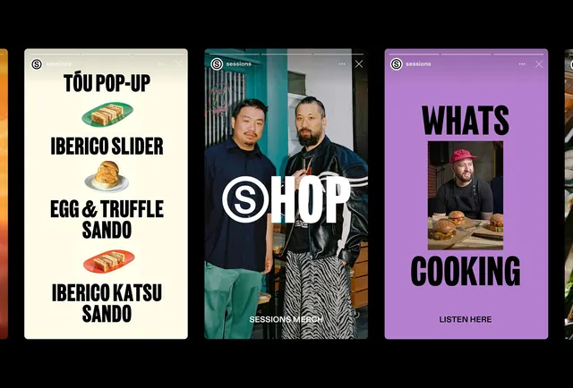
A collection of three vertical social media story templates featuring food menus, lifestyle photography, and promotional text.
Summary
A collection of three vertical social media story templates featuring food menus, lifestyle photography, and promotional text.
Visual description
The layout uses high-contrast typography paired with centered imagery or product shots. One panel features a cream background with food items and text, another shows a lifestyle photograph with a large 'SHOP' overlay, and the third uses a vibrant purple background with large 'WHATS COOKING' text.
Key takeaway
Use oversized, bold sans-serif typography as a primary graphic element to create immediate visual impact in vertical formats.
Reuse notes
Ideal for restaurant social media announcements, product launches, or lifestyle brand storytelling on Instagram Stories.
More like this
Keep what you find
A free account saves references to boards and can send you a weekly email of picks based on what you save.
To see every result, go Pro.