Preview image. Unlock full-res
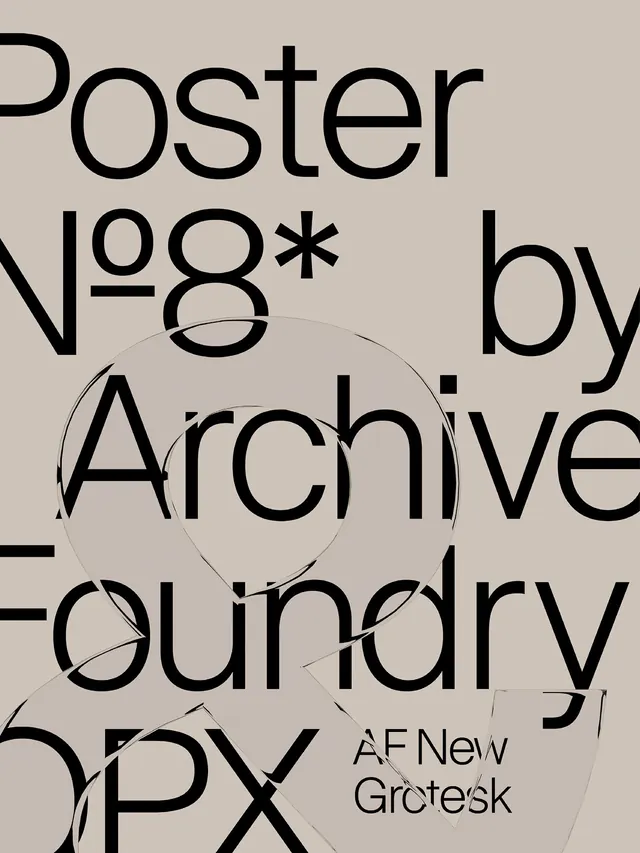
Vertical editorial spread design featuring typography-driven layout, warm color palette, and editorial hierarchy with balanced whitespace.
Summary
An editorial design layout in vertical format emphasizing typography and careful spacing. Warm, sophisticated palette with refined type hierarchy creates an approachable yet premium publication feel.
Visual description
Portrait-format editorial page (1400x1866px) with light warm background. Display typography dominates the composition, using size and weight to establish hierarchy. Supporting text in smaller serif or sans-serif sits within generous margins. Warm gray accents provide subtle visual interest without distraction. Layout balances text blocks with whitespace, creating a contemplative, easy-to-read composition. No photographic elements or bold graphics compete with the typography.
Key takeaway
Editorial design succeeds when typography is treated as primary visual element, not just content delivery. The warm palette and spacious layout signal quality and care. Generous margins and breathing room between text blocks improve readability and convey luxury.
Reuse notes
Model for magazine layouts, long-form content, books, and premium digital publications. The typography-first approach works well with variable content lengths. Warm palette conveys sophistication without coldness. Scale typography thoughtfully: large display faces for headlines, comfortable body copy sizes for readability. Pair with quality images that respect the refined aesthetic.
More like this

Keep what you find
A free account saves references to boards and can send you a weekly email of picks based on what you save.
To see every result, go Pro.