Preview image. Unlock full-res
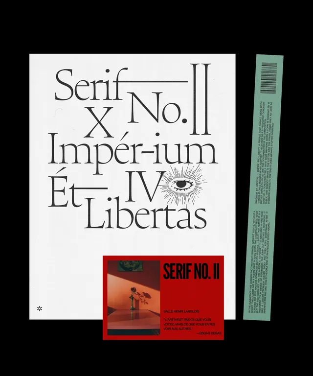
A pair of typographic editorial print compositions exploring serif type and film culture, mixing handwritten script, bold display fonts, photography, and collage elements.
More like this
See all
Summary
A pair of typographic editorial print compositions exploring serif type and film culture, mixing handwritten script, bold display fonts, photography, and collage elements.
Visual description
A three-piece editorial layout combining serif typography with archival design. The main cream-colored poster features large serif type arranged in a loose diagonal composition spelling out Latin phrases, anchored by a small engraved eye illustration. A bold red rectangle insets a film still and smaller type announcing the series, while a tall green strip on the right edge carries dense body text in a narrow column. The pieces stack with intentional overlap and breathing room, mixing ornamental and utilitarian type scales.
Key takeaway
Layer printed pieces at different scales and color densities to create compositional depth on a flat surface. Reserve one accent color for emphasis while letting the majority of space remain neutral, allowing type and photography to command attention.
Reuse notes
Reach for this as a editorial spread reference. Pairs with typographic, experimental directions. Original by siddharth.
More like this
Keep what you find
A free account saves references to boards and can send you a weekly email of picks based on what you save.
To see every result, go Pro.