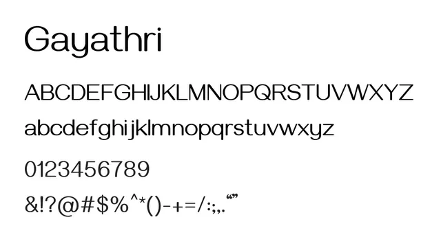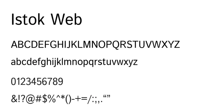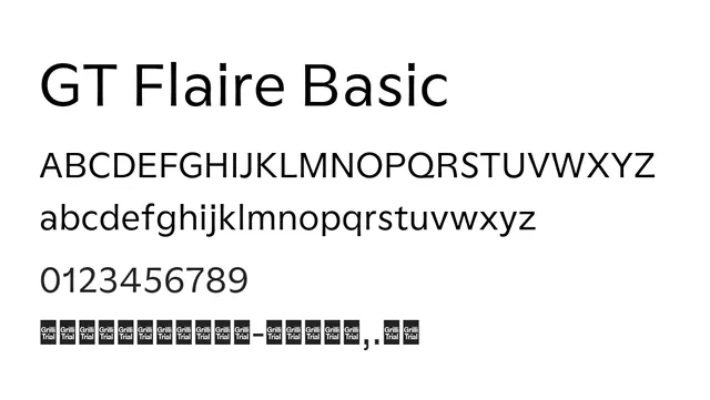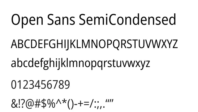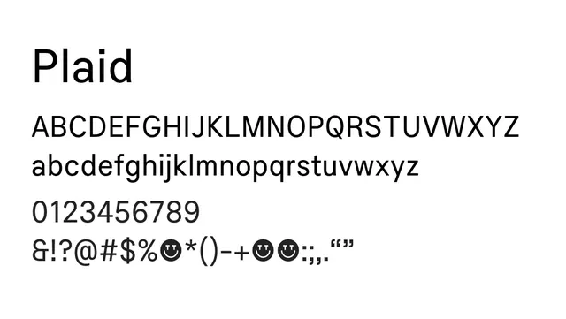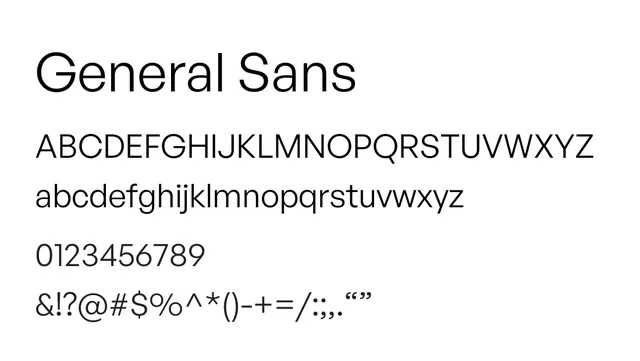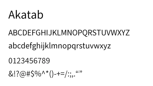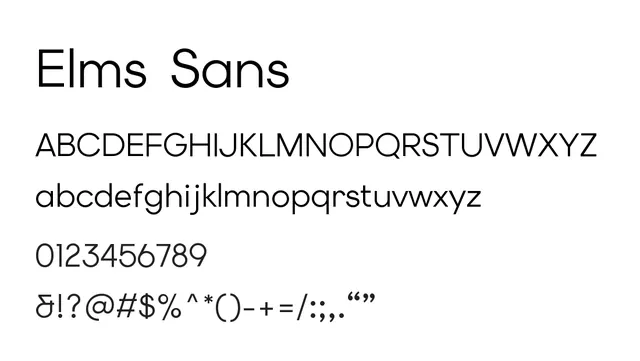
Preview image. Unlock full-res
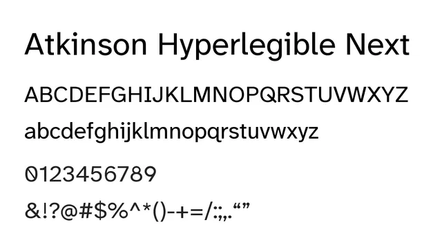
Refined neo-grotesque sans designed for accessibility with improved optical spacing and character differentiation.
Typesans-serif, neo-grotesque
Moodprofessional, reliable, accessible, minimal
Industrysaas, fintech, education, accessibility
Summary
Refined neo-grotesque sans designed for accessibility with improved optical spacing and character differentiation.
What to use it for
Best used for interface design, system UI, and body text in applications requiring WCAG accessibility compliance. The Next variant offers improved spacing and character clarity.
Pairing
Complements well with Atkinson Hyperlegible Mono for technical contexts or with Merriweather for editorial hybrid layouts.