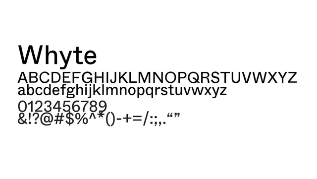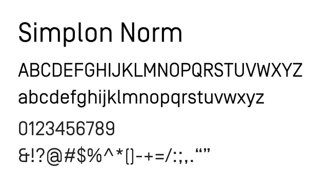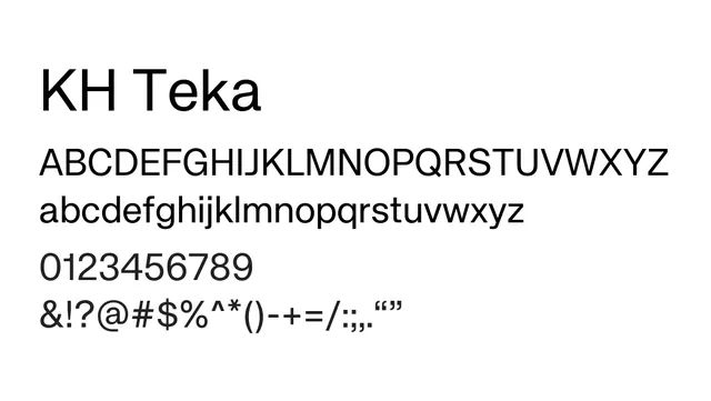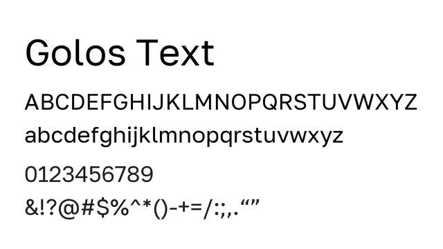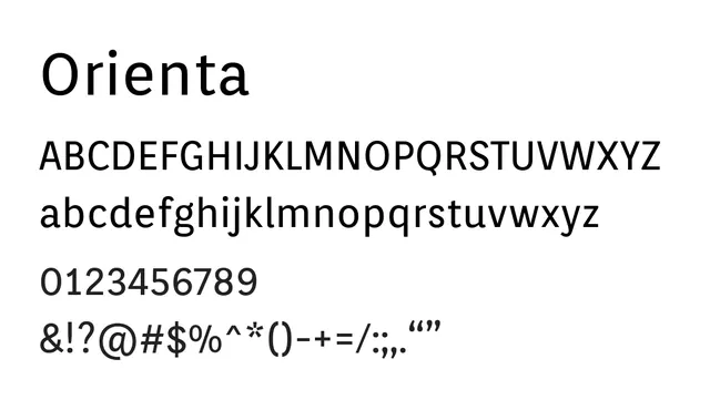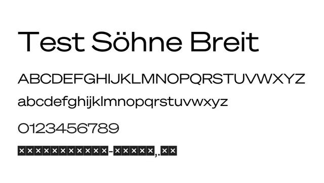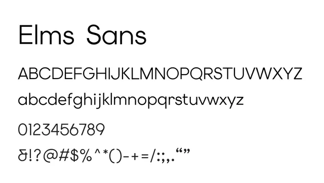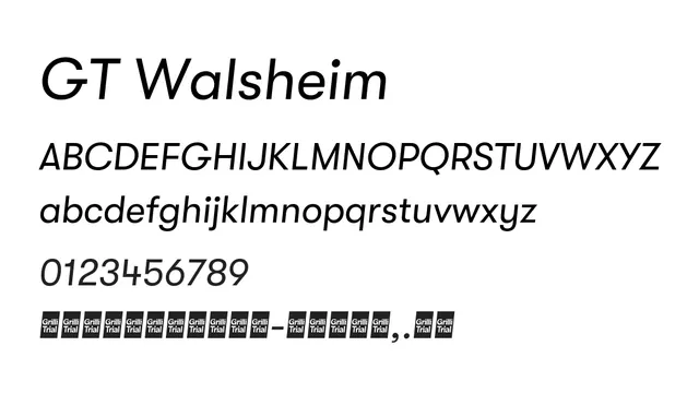
Preview image. Unlock full-res
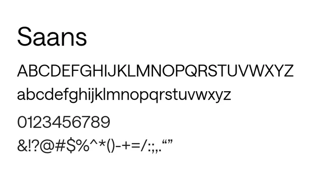
A refined neo-grotesque sans-serif with balanced proportions and excellent versatility across text and display sizes.
Typesans-serif, modern
Moodneutral, professional, contemporary, minimal
Summary
A refined neo-grotesque sans-serif with balanced proportions and excellent versatility across text and display sizes.
What to use it for
Saans functions beautifully as a primary typeface for web and app interfaces, offering clear hierarchy and comfortable readability at both small and large scales.
Pairing
Pairs effectively with Saans Mono for technical contexts, or with a traditional serif like Baskerville for editorial applications.