Preview image. Unlock full-res
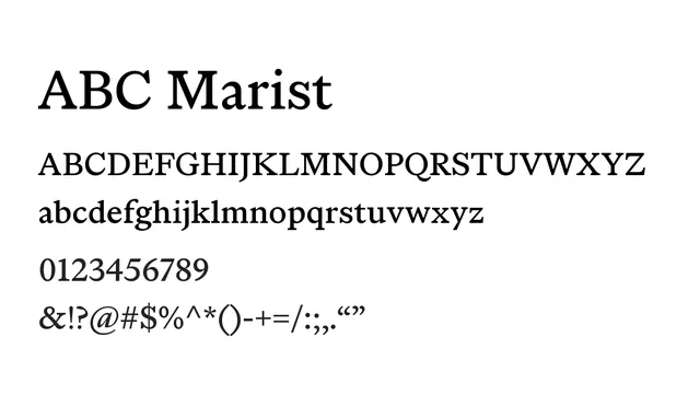
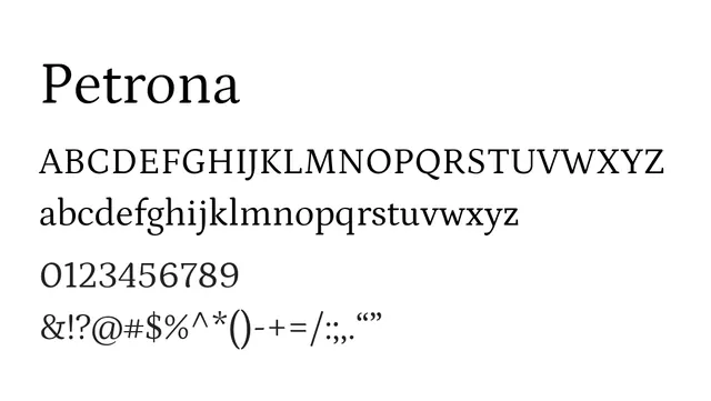
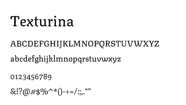
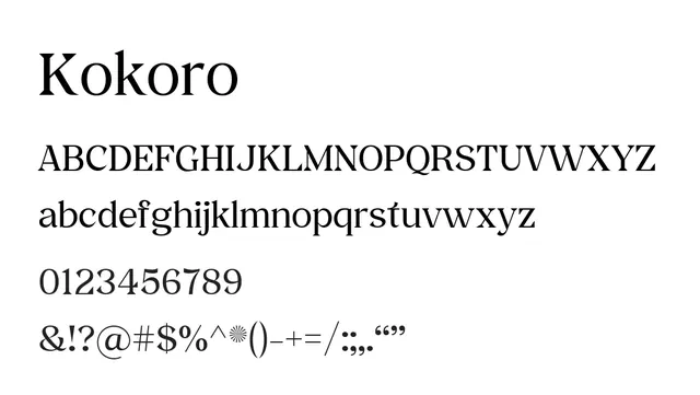
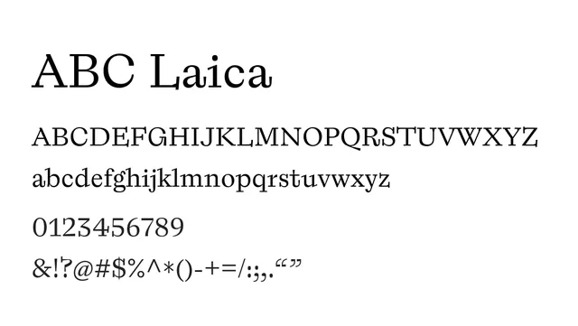
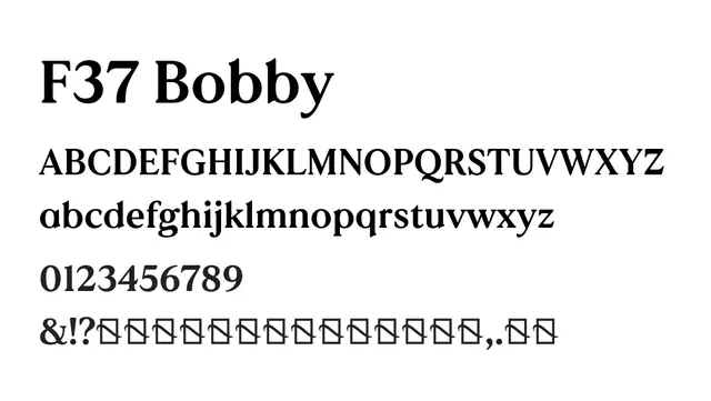
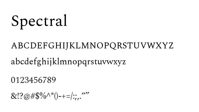
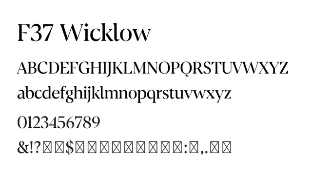
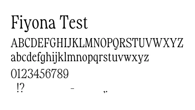
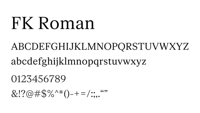
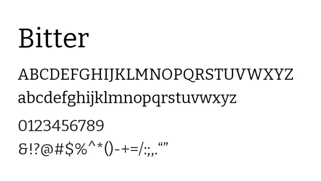
A transitional serif with elegant proportions and strong contrast, designed for editorial use and sophisticated typography.
Typeserif, transitional
Moodsophisticated, confident, classic, warm
Industryeditorial, publishing, branding, fashion
Summary
A transitional serif with elegant proportions and strong contrast, designed for editorial use and sophisticated typography.
What to use it for
Ideal for editorial projects, book design, and magazine headlines. The generous x-height and readable letterforms work well for both headlines and body text in publications.
Pairing
Pair with a geometric sans-serif like Poppins or Inter for contemporary editorial layouts that blend classic and modern aesthetics.