Preview image. Unlock full-res
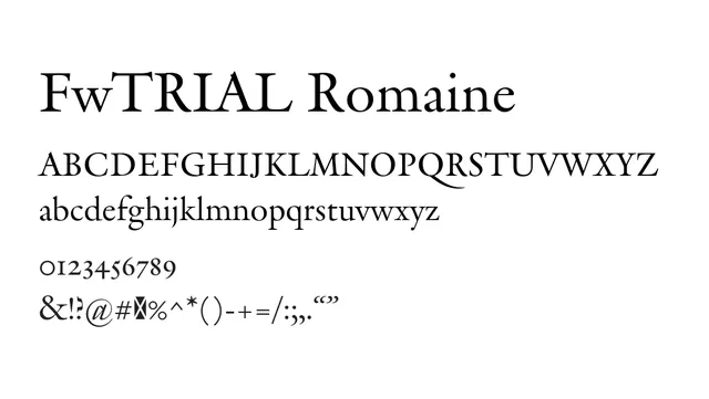
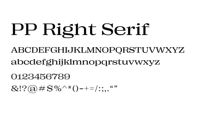
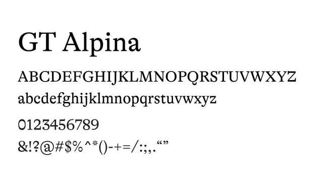
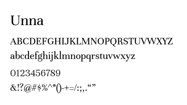
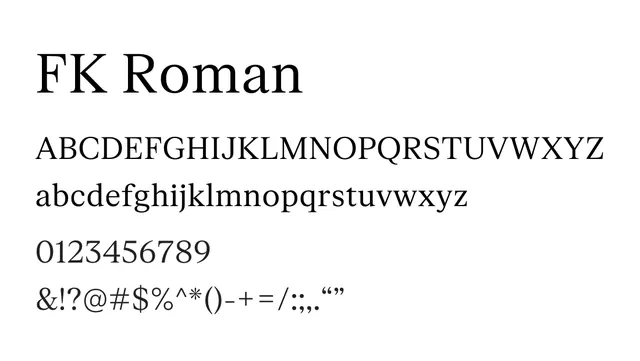
A transitional serif with balanced proportions and readable character, suitable for editorial and premium branding applications.
Typeserif, transitional
Moodsophisticated, confident, warm, editorial
Industryeditorial, publishing, branding, luxury, corporate
Summary
A transitional serif with balanced proportions and readable character, suitable for editorial and premium branding applications.
What to use it for
Use FK Roman for body text in editorial publications, marketing materials, and sophisticated branding. The transitional character bridges classical and modern sensibilities, making it versatile across contexts.
Pairing
Pair with FK Grotesk Neue for headlines and supporting sans-serif elements, or use a simpler geometric sans like FK Display for contrast.