Preview image. Unlock full-res
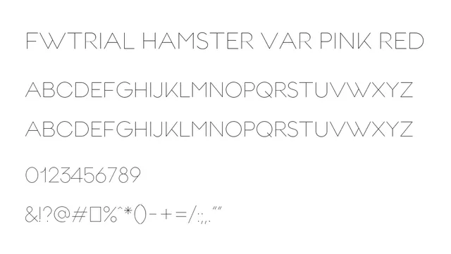
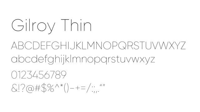
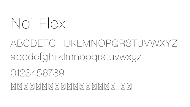
A thin, minimal neo-grotesque sans-serif with clean lines and open proportions, perfect for refined modern typography.
Typesans-serif, neo-grotesque
Moodneutral, technical, sophisticated
Summary
A thin, minimal neo-grotesque sans-serif with clean lines and open proportions, perfect for refined modern typography.
What to use it for
Excellent for branding, editorial headings, and UI applications where elegance and minimalism are key. The thin weight and high elegance work well for luxury brands and contemporary design.
Pairing
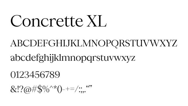
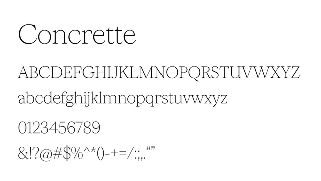
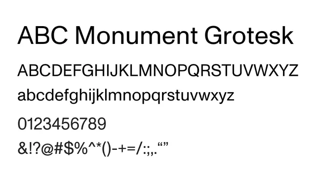
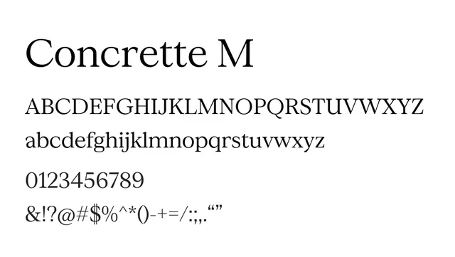
Pairs well with Concrette Italic (serif) for editorial design, or with a geometric sans-serif like Montserrat for a modern, layered typographic system.