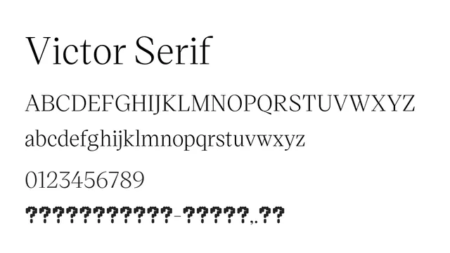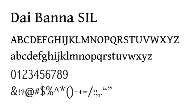
Preview image. Unlock full-res
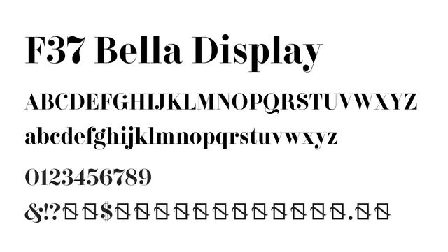
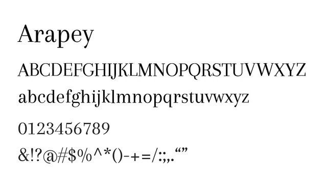
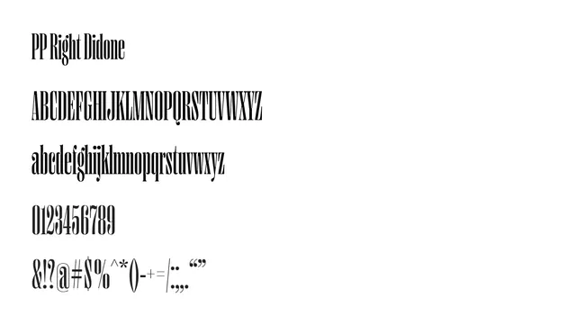
A high-contrast didone serif with dramatic thick and thin strokes, bringing classical elegance and sophistication.
Styleelegant, refined, sophisticated, classical, luxury
Typeprimary: serif, didone, high-contrast, elegant
Moodelegant, sophisticated, confident, premium
Summary
A high-contrast didone serif with dramatic thick and thin strokes, bringing classical elegance and sophistication.
What to use it for
Perfect for headlines, logos, and premium branding where elegance matters. Best used at display sizes; avoid for body text due to thin hairlines that can disappear at small sizes.
Pairing
Pairs well with a clean sans-serif like Cutive Font or a simple monospace for elegant editorial layouts.