Preview image. Unlock full-res
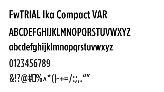
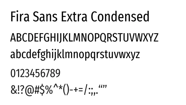
An extra-condensed neo-grotesque for maximum space efficiency and visual impact in tight layouts and bold headlines.
Stylemodern, compact, functional, bold
Typesans-serif, neo-grotesque
Moodtechnical, energetic, professional, focused
Summary
An extra-condensed neo-grotesque for maximum space efficiency and visual impact in tight layouts and bold headlines.
What to use it for
Best suited for headlines, navigation labels, and UI elements where horizontal space is at a premium. The compressed width creates impact without losing legibility at reasonable sizes.
Pairing
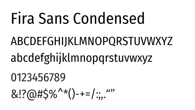
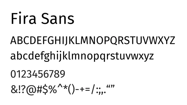
Complements Fira Sans regular for body text, or pairs with serif fonts like PT Serif for editorial contrast.