Preview image. Unlock full-res
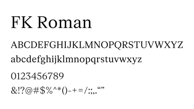
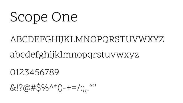
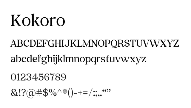
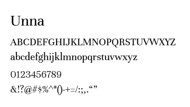
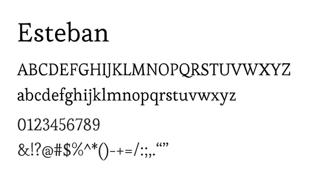
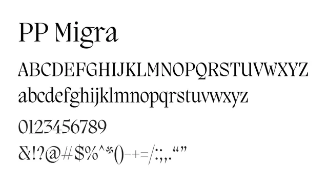
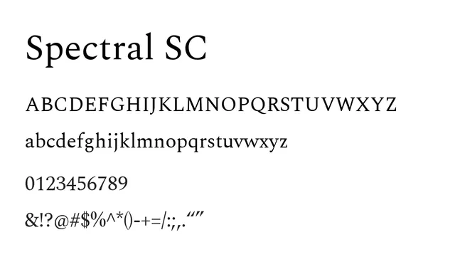
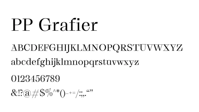
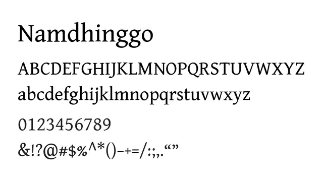
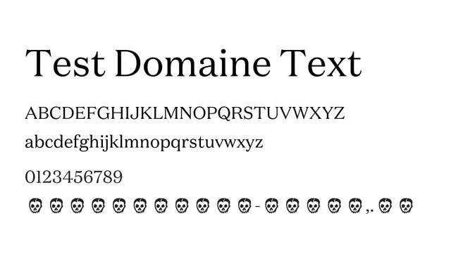
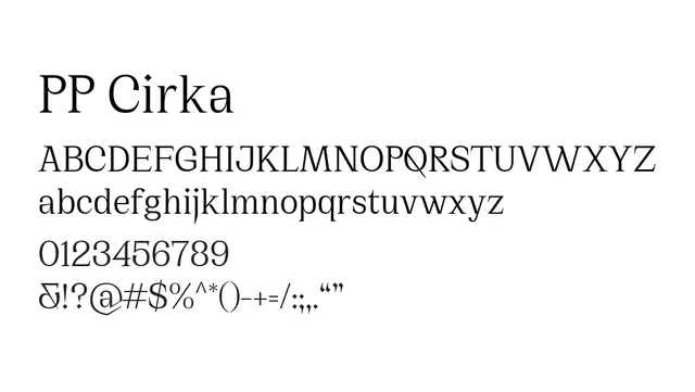
A transitional serif with balanced weight variation and elegant serifs, offering warmth and readability for editorial and literary applications.
Industryeditorial, publishing, literature, luxury
Summary
A transitional serif with balanced weight variation and elegant serifs, offering warmth and readability for editorial and literary applications.
What to use it for
Excellent for editorial body text and headlines where elegance meets readability. Its warm character works well in literary publications and premium content.
Pairing
Complements modern sans-serifs like PP Editorial Sans or humanist options like PP Eiko for a contemporary-classic editorial pairing.