Preview image. Unlock full-res
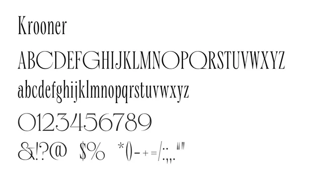
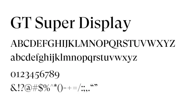
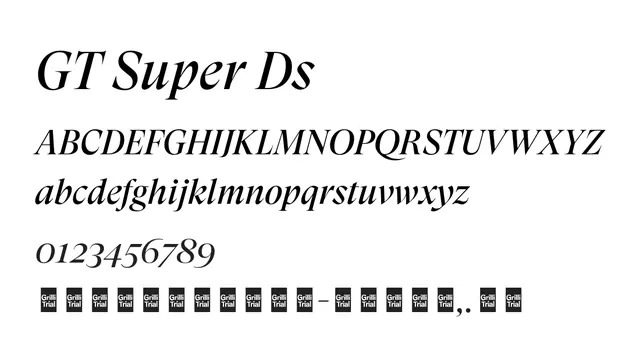
A high-contrast didone serif with theatrical elegance and strong editorial presence.
Typeserif, didone, high-contrast
Moodsophisticated, literary, upscale, confident
Industryeditorial, fashion, luxury, publishing
Summary
A high-contrast didone serif with theatrical elegance and strong editorial presence.
What to use it for
Best suited for headlines, display use, and luxury branding where drama and sophistication are required. Not recommended for body text due to high contrast.
Pairing
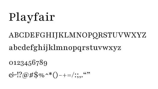
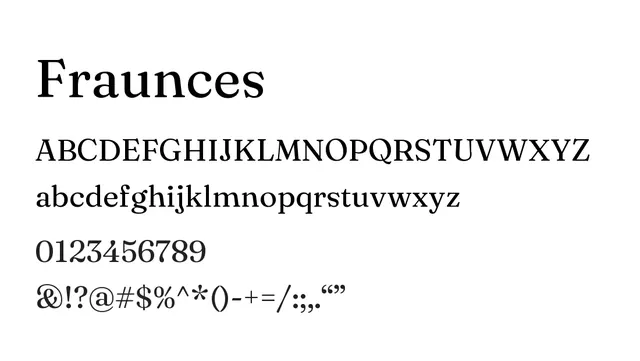
Pairs well with Lato or Inter for complementary sans-serif support.