Preview image. Unlock full-res
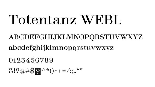
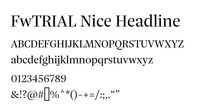
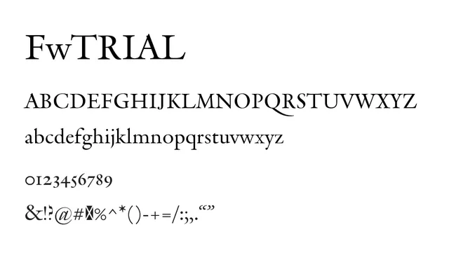
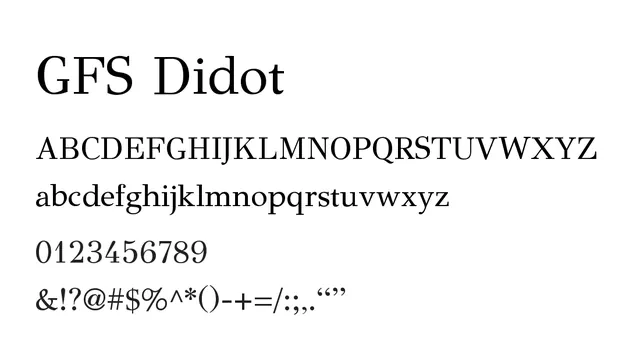
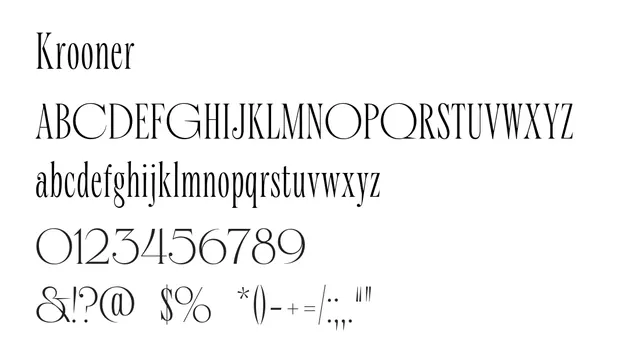
A high-contrast didone serif with classical proportions and dramatic thick-thin contrast; elegant and distinctly editorial in character.
Typeserif, didone, high-contrast
Moodsophisticated, elegant, formal, dramatic
Industryeditorial, fashion, luxury, publishing
Summary
A high-contrast didone serif with classical proportions and dramatic thick-thin contrast; elegant and distinctly editorial in character.
What to use it for
Perfect for editorial headlines, luxury branding, and refined print contexts where classical elegance is desired. Best used at large sizes where its delicate hairlines and strong serifs can be appreciated. Works well in magazine design and premium publications.
Pairing
Pairs beautifully with a warm sans-serif like Komplekt for supporting text, or with a geometric display font for modern editorial layouts.