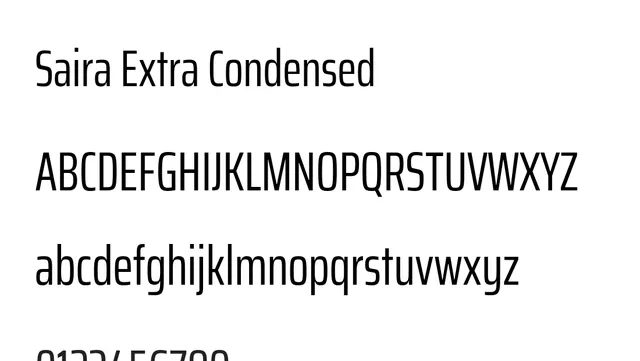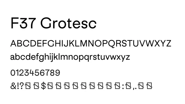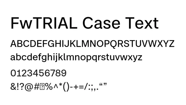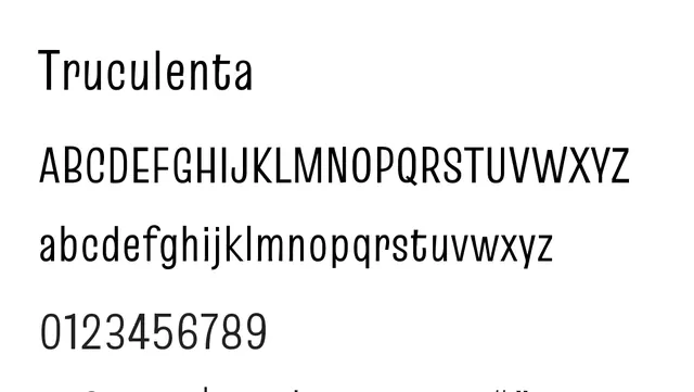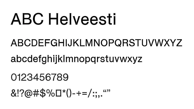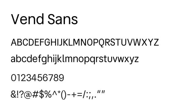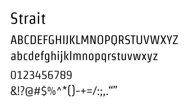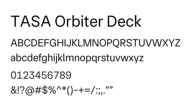
Preview image. Unlock full-res
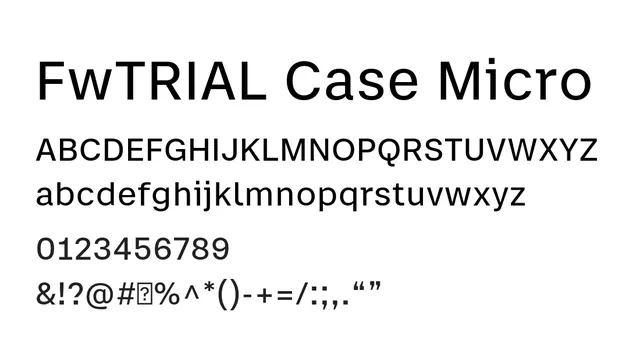
Micro-optimized neo-grotesque sans-serif with high contrast and compact spacing, engineered for superior legibility in small text and dense information layouts.
Styleprofessional, minimal, technical, precise
Typesans-serif, neo-grotesque
Moodneutral, confident, technical, businesslike
Summary
Micro-optimized neo-grotesque sans-serif with high contrast and compact spacing, engineered for superior legibility in small text and dense information layouts.
What to use it for
Designed specifically for small text applications: UI labels, captions, footnotes, financial data displays, and information-dense interfaces. The high contrast and precise spacing ensure readability at minimal sizes where standard fonts struggle.
Pairing
Use with FwTRIAL Case Text for larger copy, or pair with a serif for editorial publications requiring small-print legibility.