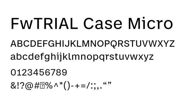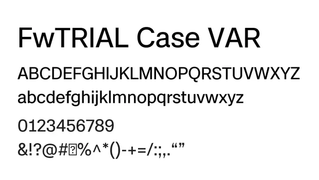
Preview image. Unlock full-res
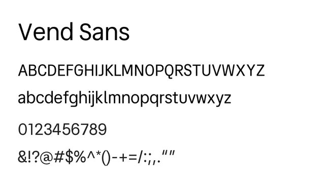
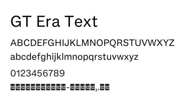
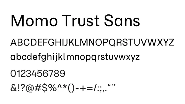
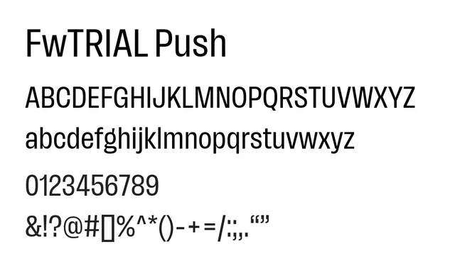
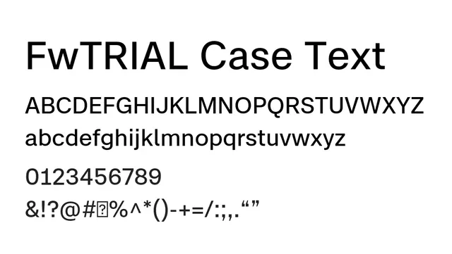
Text-optimized neo-grotesque sans-serif with balanced proportions and medium contrast, designed for extended reading and professional editorial use.
Styleprofessional, balanced, readable, editorial
Typesans-serif, neo-grotesque
Industryeditorial, corporate, saas, publishing, fintech
Summary
Text-optimized neo-grotesque sans-serif with balanced proportions and medium contrast, designed for extended reading and professional editorial use.
What to use it for
Excellent for body text in editorial design, corporate communications, and UI applications where readability and professional appearance are essential. The balanced letterforms and carefully tuned spacing support comfortable extended reading without fatigue.
Pairing
Pair with FwTRIAL Case Micro for captions and small text, or use across the entire typographic hierarchy with weight variations for cohesive systems.