Preview image. Unlock full-res
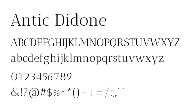
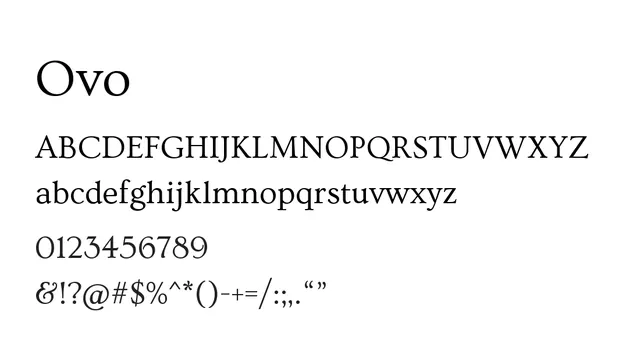
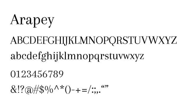
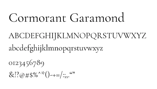
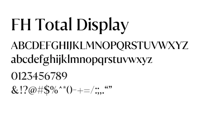
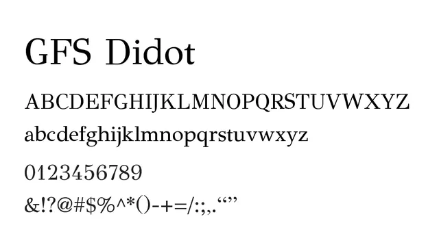
A classical Didone serif with dramatic contrast between thick and thin strokes, exuding elegance and editorial refinement.
Styleelegant, classical, refined, high-contrast
Moodelegant, sophisticated, luxurious, timeless
Industryfashion, luxury, editorial, publishing
Summary
A classical Didone serif with dramatic contrast between thick and thin strokes, exuding elegance and editorial refinement.
What to use it for
Excellent for editorial headlines, luxury branding, and sophisticated displays. The high contrast and elegant proportions work best at larger sizes for maximum impact and legibility.
Pairing
Pairs beautifully with GFS Neohellenic or a clean sans-serif like Open Sans for supporting body text and captions.