Preview image. Unlock full-res
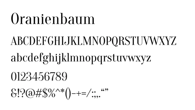
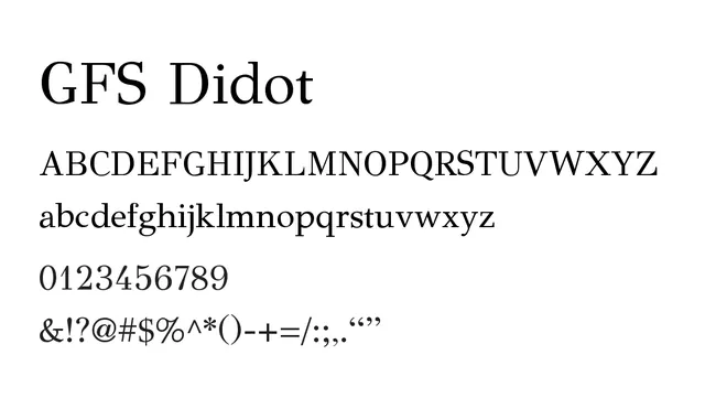
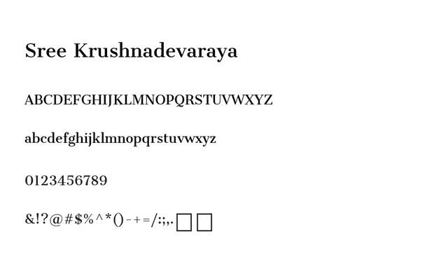
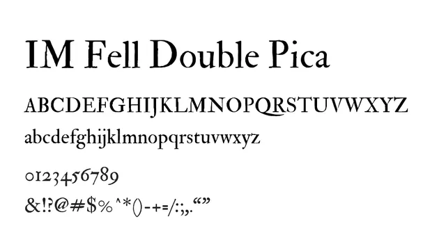
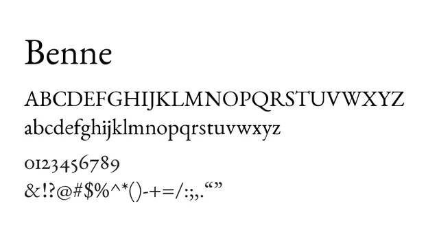
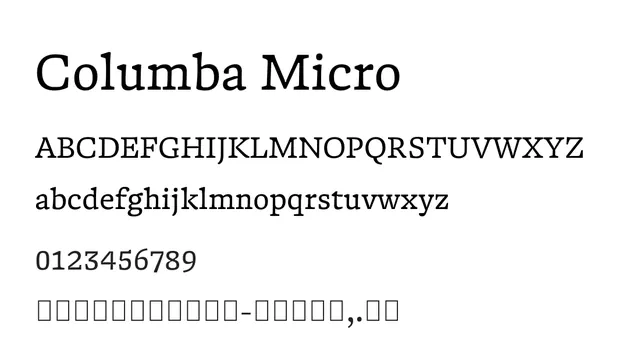
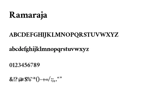
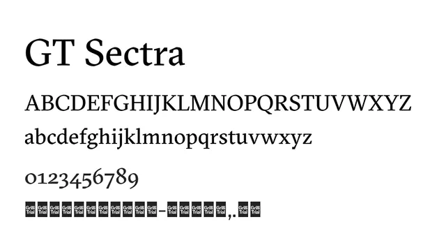
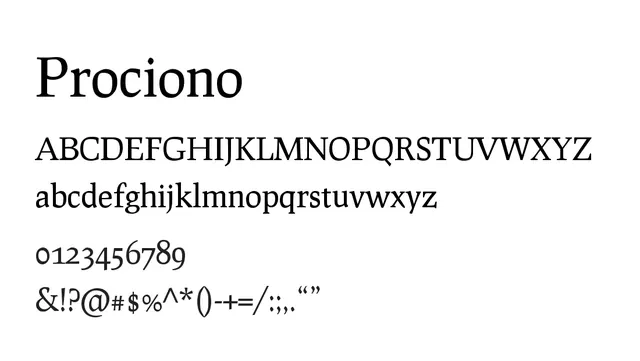
A classical didone serif with strong stroke contrast and elegant proportions, evoking traditional typography and refined aesthetic.
Styleelegant, classical, formal, high-contrast
Industryeditorial, luxury, fashion, publishing, fine-art
Summary
A classical didone serif with strong stroke contrast and elegant proportions, evoking traditional typography and refined aesthetic.
What to use it for
Best used for headlines, luxury branding, and editorial design where a sophisticated, authoritative voice is needed. The high contrast and traditional forms convey elegance and timelessness.
Pairing
Pairs beautifully with a clean geometric sans like Prompt for body copy contrast, or use solo for full editorial layouts.