Preview image. Unlock full-res
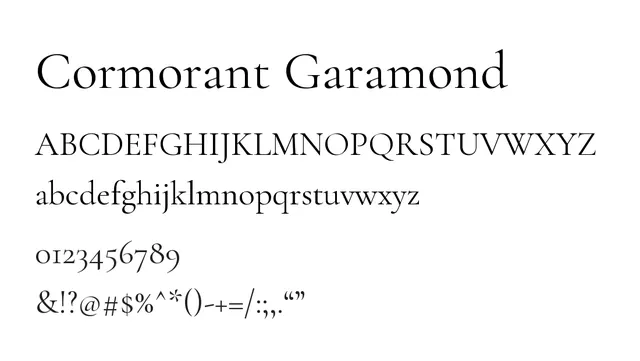
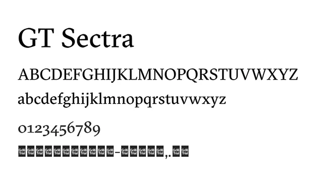
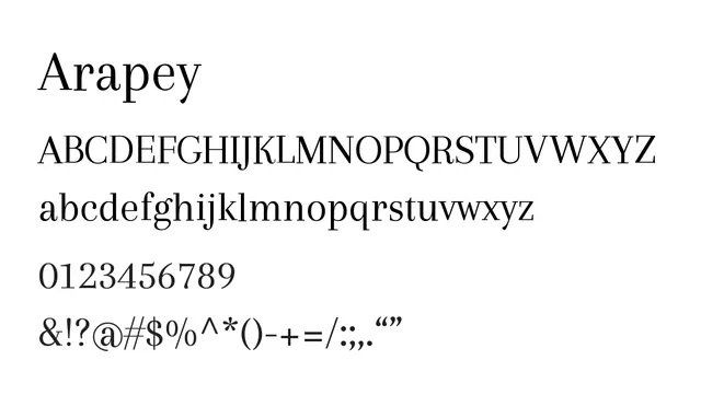
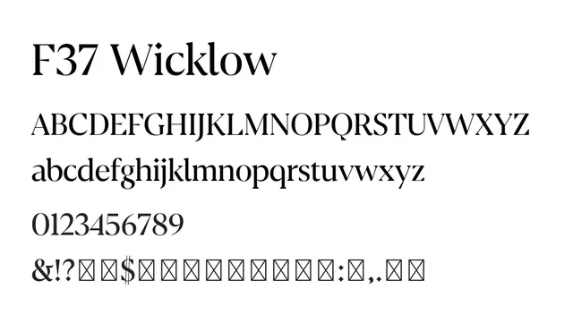
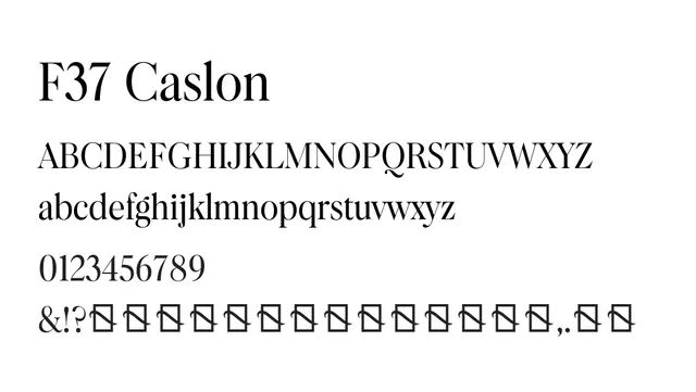
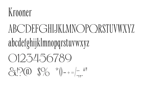
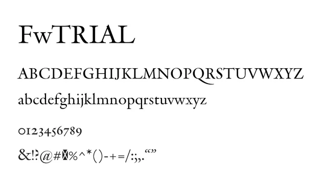
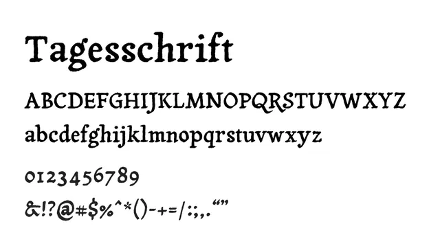
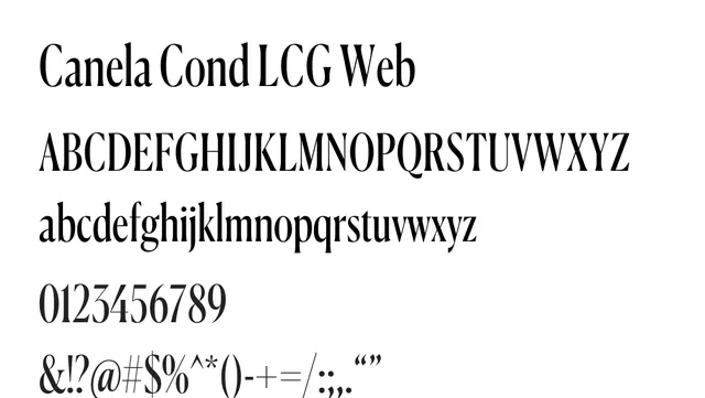
A refined, high-contrast didone serif with elegant proportions and dramatic thick/thin variation suited for luxury editorial and upscale branding.
Moodsophisticated, confident, timeless
Industryfashion, luxury, editorial, publishing, branding
Summary
A refined, high-contrast didone serif with elegant proportions and dramatic thick/thin variation suited for luxury editorial and upscale branding.
What to use it for
Designed for headlines and display applications in editorial and luxury contexts. The pronounced contrast and classical serifs evoke sophistication and editorial polish. Works best in larger sizes and shorter text runs where the contrast enhances elegance rather than texture.
Pairing
Pairs beautifully with Inter for a contemporary serif/sans combination, or with Minion Pro for a traditional, all-serif classical aesthetic.