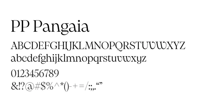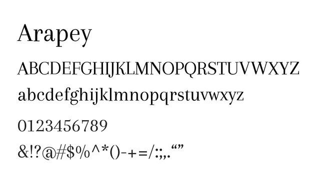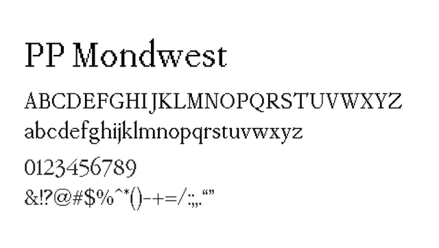
Preview image. Unlock full-res
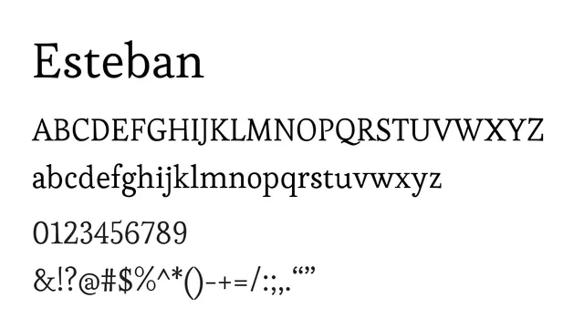
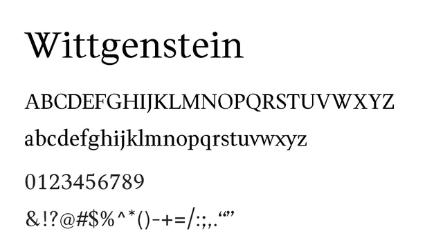
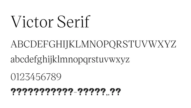
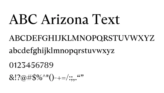
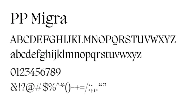
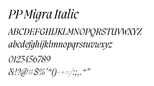
A transitional serif with classical elegance and excellent readability for editorial and publishing applications.
Typeserif, transitional
Moodwarm, sophisticated, confident
Industryeditorial, publishing, luxury, academic
Summary
A transitional serif with classical elegance and excellent readability for editorial and publishing applications.
What to use it for
Ideal for long-form editorial content, book publishing, and luxury branding. Its moderate contrast and balanced letterforms ensure comfortable reading at body sizes while maintaining sophistication.
Pairing
Pairs well with a geometric sans-serif like Montserrat or Futura for contemporary contrast.