Preview image. Unlock full-res
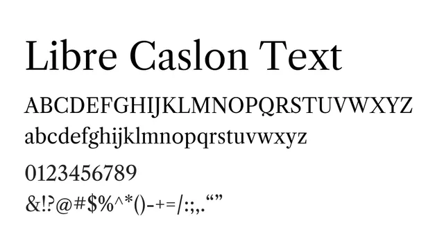
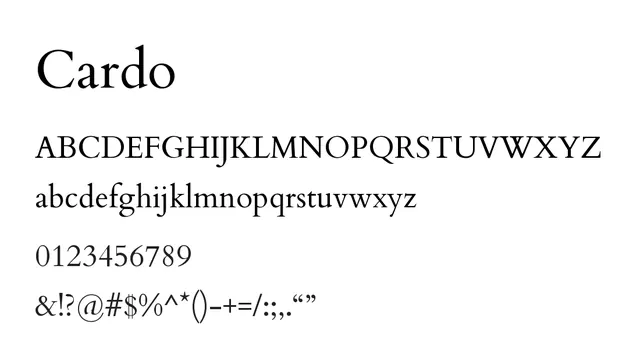
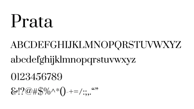
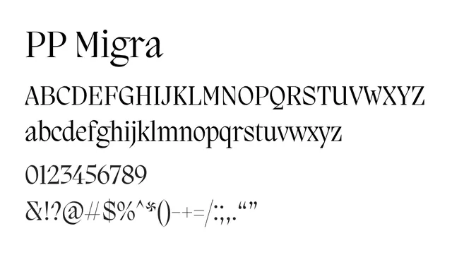
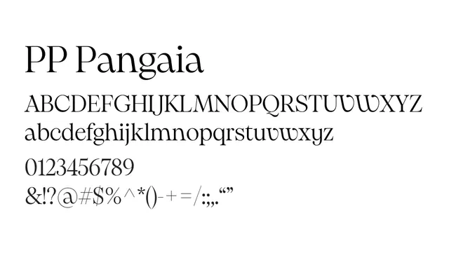
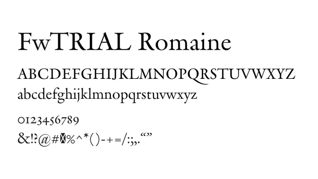
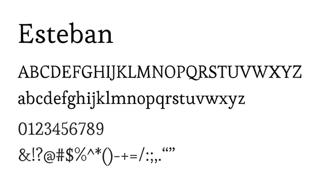
A refined transitional serif with balanced proportions and classical elegance, equally at home in headline or body contexts.
Typeserif, transitional
Moodsophisticated, warm, traditional, refined
Industryeditorial, publishing, luxury, academic, branding
Summary
A refined transitional serif with balanced proportions and classical elegance, equally at home in headline or body contexts.
What to use it for
Excellent for editorial body text and headlines alike. Its moderate contrast and balanced letterforms provide strong readability while conveying sophistication. Ideal for books, magazines, and branding where traditional elegance matters.
Pairing
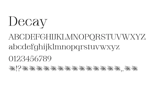
Pairs beautifully with Ephesis for classical editorial layouts, or Epunda Sans for contemporary contrast mixing serif and sans traditions.