Preview image. Unlock full-res
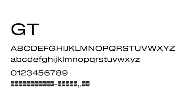
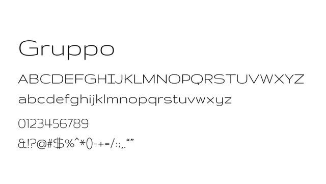
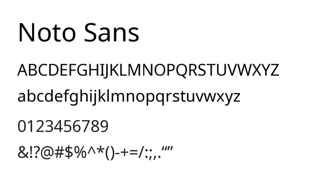
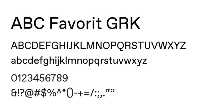
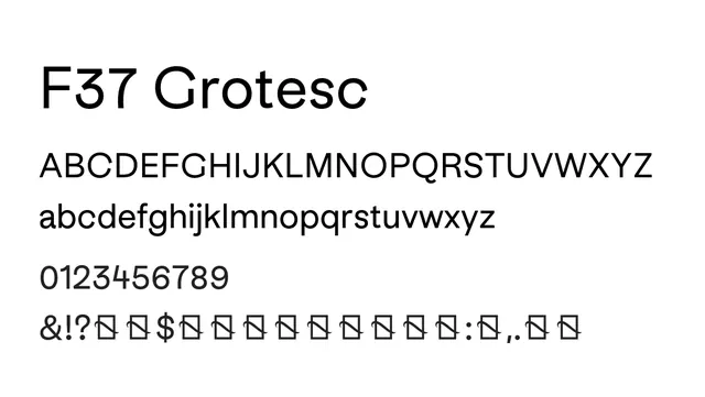
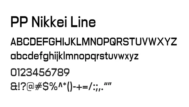
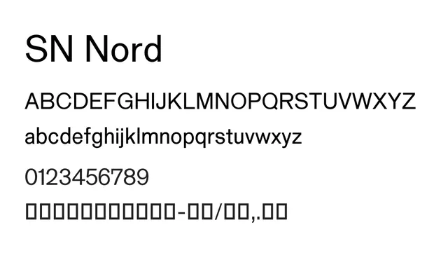
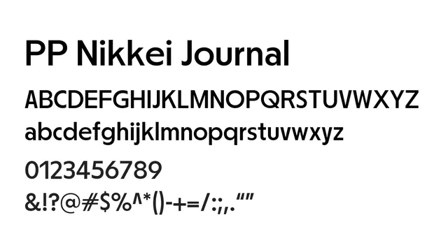
Geometric sans-serif with balanced, neutral proportions ideal for editorial and interface design.
Typesans-serif, geometric
Summary
Geometric sans-serif with balanced, neutral proportions ideal for editorial and interface design.
What to use it for
Excellent for headlines, body text, and UI where clean, modern aesthetics are valued. Works equally well in editorial contexts and digital products.
Pairing
Pairs well with serif families like Bodoni or Garamond for editorial projects requiring hierarchy.