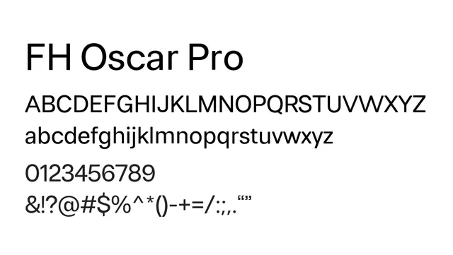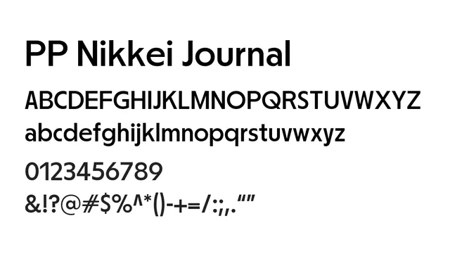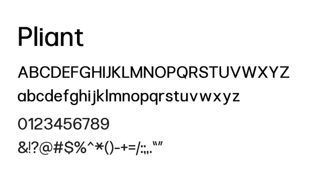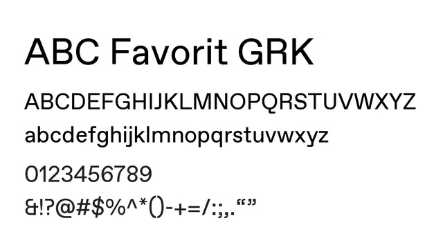
Preview image. Unlock full-res
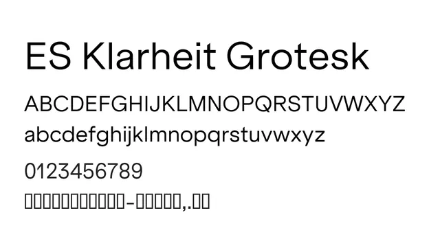
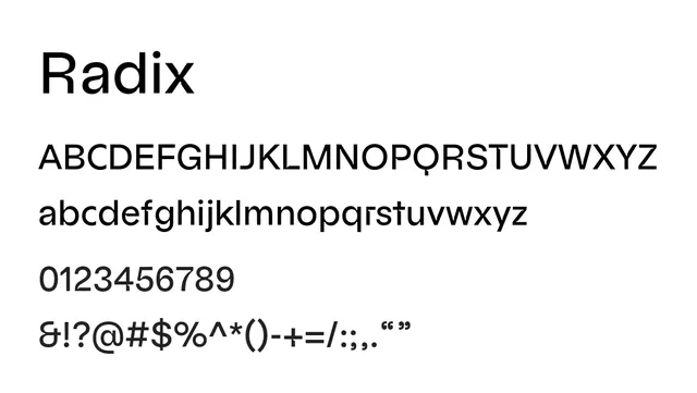
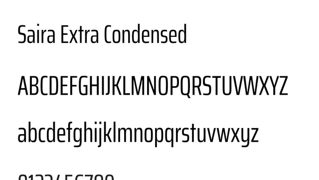
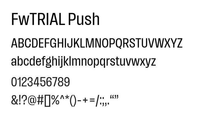
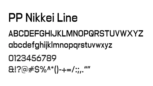
Linear geometric sans-serif with consistent stroke weight for a stripped-down, modern aesthetic.
Stylemodern, minimalist, clean, geometric
Typesans-serif, geometric
Summary
Linear geometric sans-serif with consistent stroke weight for a stripped-down, modern aesthetic.
What to use it for
Best used for headlines, branding, and UI design where visual clarity and minimalism are priorities. Strong presence at larger sizes.
Pairing
Complements serif families like Didot or modern serifs for high-contrast editorial layouts.