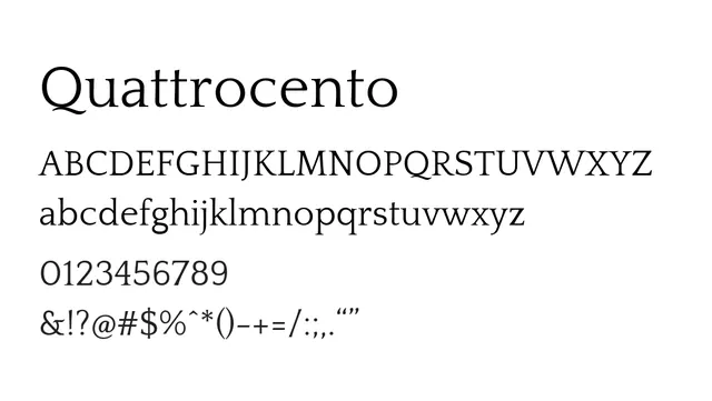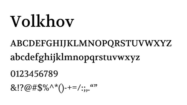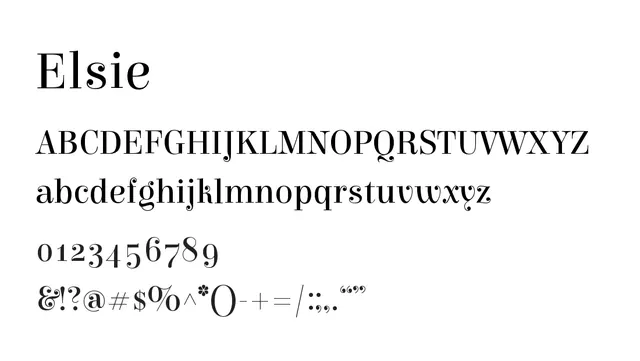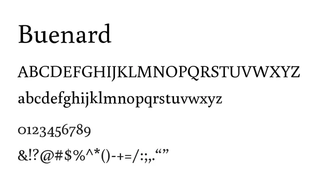
Preview image. Unlock full-res
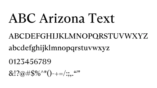
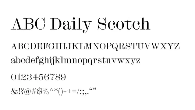
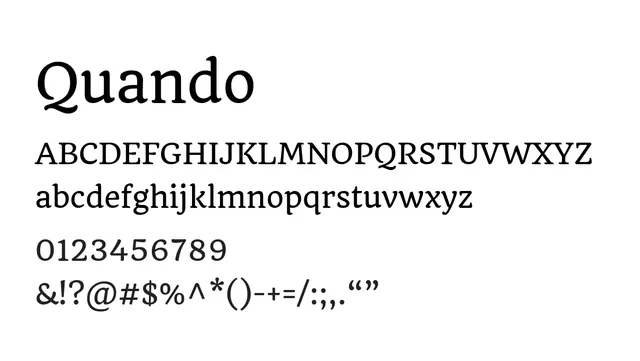
Transitional serif with classical proportions and warm elegance—ideal for editorial and brand positioning.
Styleelegant, classical, traditional, professional
Typeserif, transitional
Moodwarm, confident, established, refined
Industryeditorial, publishing, academic, luxury, heritage
Summary
Transitional serif with classical proportions and warm elegance—ideal for editorial and brand positioning.
What to use it for
Quando works beautifully for long-form editorial content, book design, and upscale branding where tradition and refinement matter. Its moderate contrast and readable serifs make it excellent for print and screen body text.
Pairing
Pairs elegantly with a geometric sans-serif like Questrial for clean headline hierarchy.