Preview image. Unlock full-res
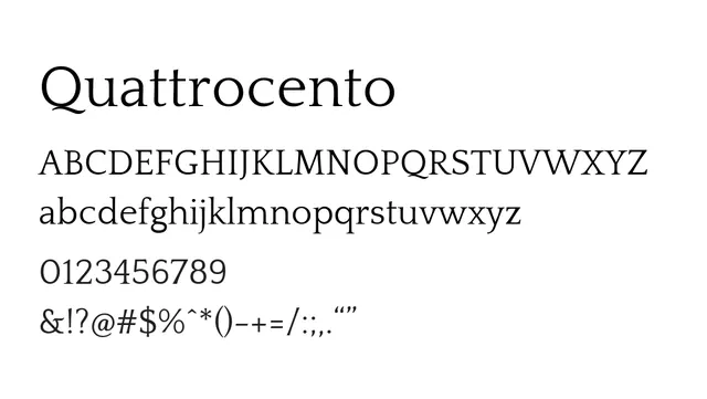
Transitional serif with warm, humanist proportions and distinctive character—elegant and versatile for editorial and brand voice.
Styleelegant, classical, warm, distinctive, human
Typeserif, transitional
Moodwarm, refined, established, cultured, confident
Summary
Transitional serif with warm, humanist proportions and distinctive character—elegant and versatile for editorial and brand voice.
What to use it for
Quattrocento is equally comfortable as both body text and headline font. Its distinctive letterforms and warm personality suit editorial brands, cultural institutions, and design-forward companies. The readable proportions work well for long-form content while maintaining personality and warmth.
Pairing
Pairs perfectly with Quattrocento Sans for a cohesive typographic family, or with a geometric sans like Questrial for contemporary contrast.