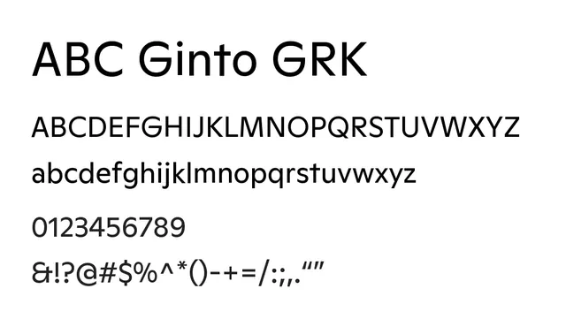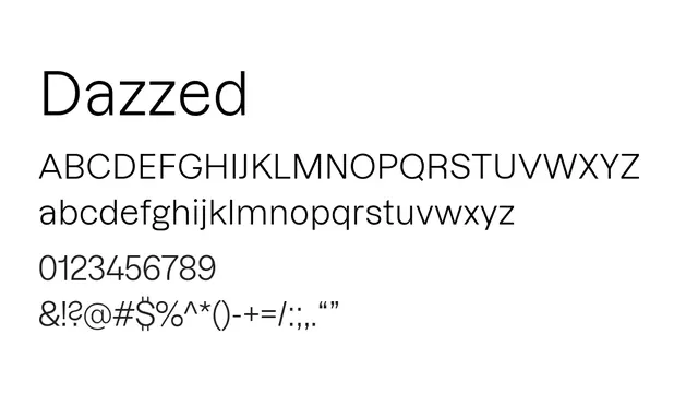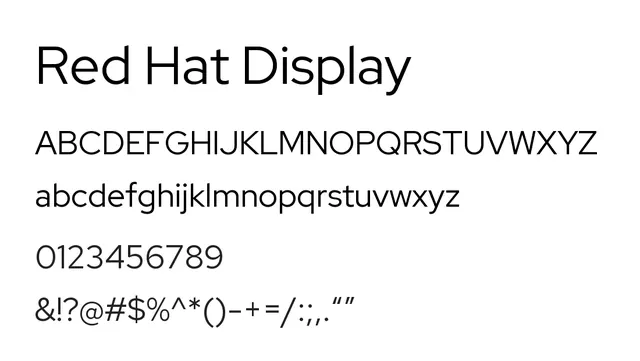
Preview image. Unlock full-res
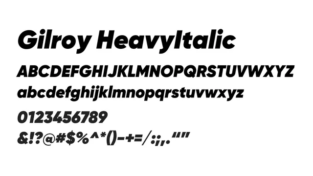
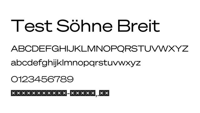
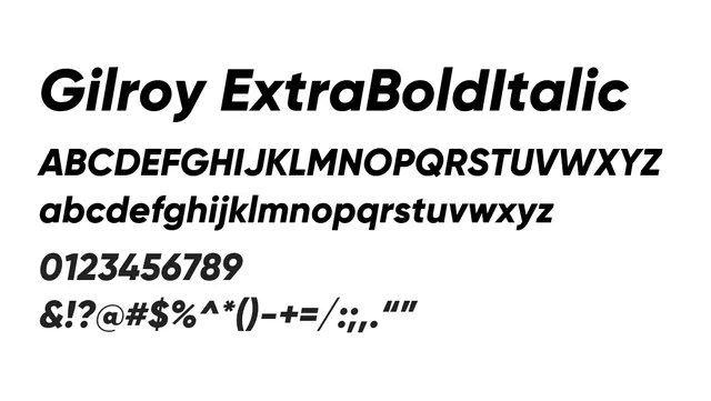
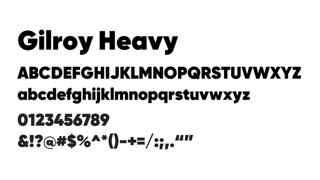
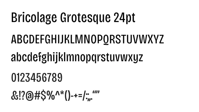
A bold, geometric display sans serif with strong character presence and excellent legibility for headlines and branding.
Typesans-serif, neo-grotesque
Summary
A bold, geometric display sans serif with strong character presence and excellent legibility for headlines and branding.
What to use it for
Best reserved for headlines and display usage. Its strong, geometric proportions and moderate-to-high contrast make it less suitable for extended body text, though lighter weights could work in large-scale editorial design.
Pairing
Pair with Red Hat Text for body copy to create a cohesive design system with excellent visual hierarchy.