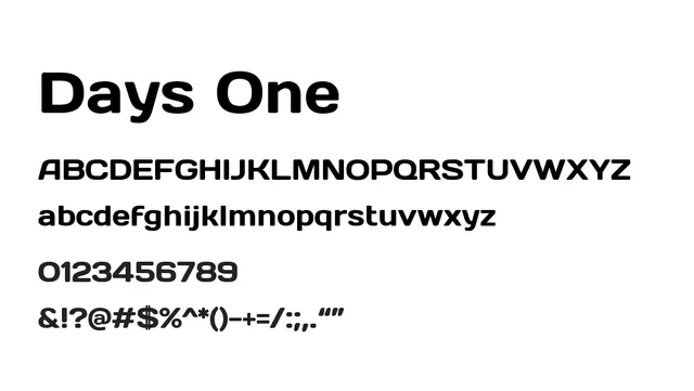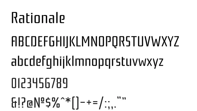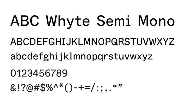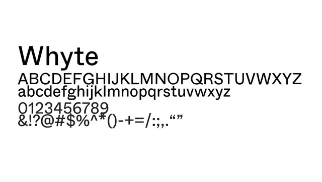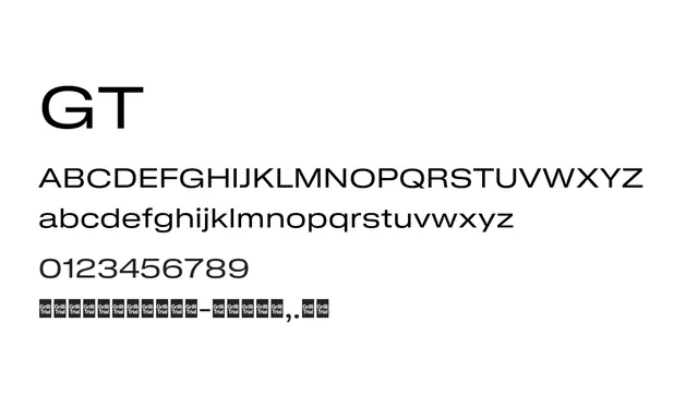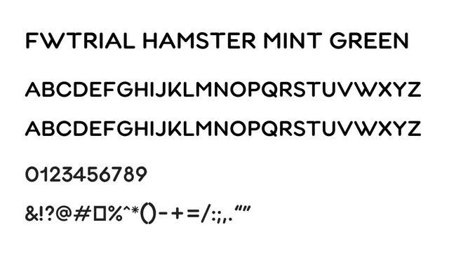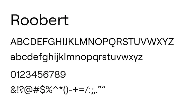
Preview image. Unlock full-res
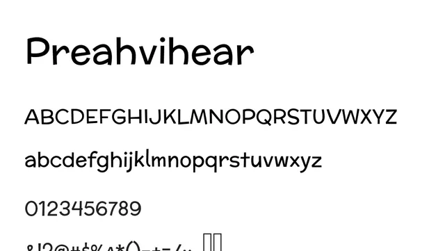
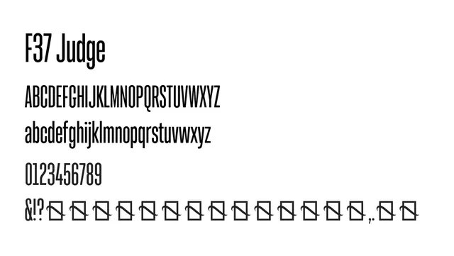
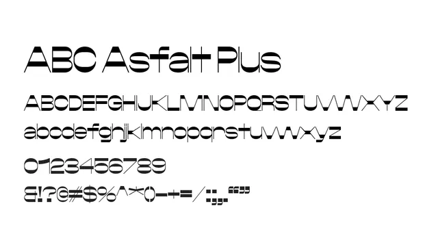
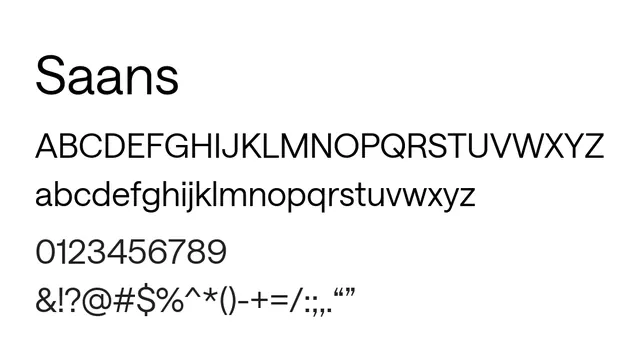
A geometric neo-grotesque sans with rounded terminals and modern sensibility, excellent for both interface and display work.
Typesans-serif, geometric
Moodneutral, confident, contemporary, minimal
Summary
A geometric neo-grotesque sans with rounded terminals and modern sensibility, excellent for both interface and display work.
What to use it for
Roobert works beautifully as a primary UI font or headline face for contemporary digital products. Its generous spacing and geometric construction make it highly legible at all sizes.
Pairing
Pairs exceptionally well with Source Mono Pro for code or technical contexts, or with a classic serif like Crimson Text for editorial layouts.