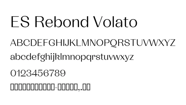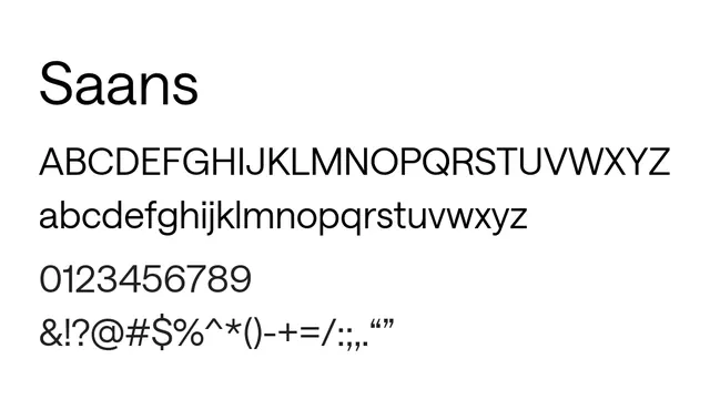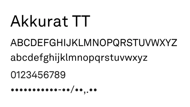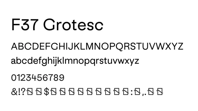
Preview image. Unlock full-res
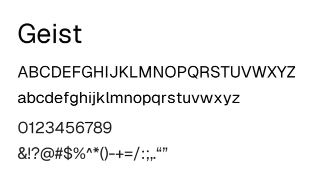
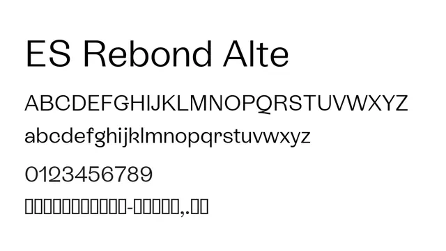
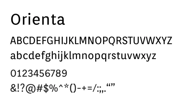
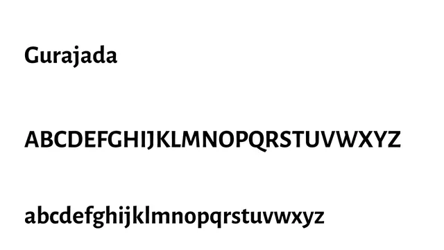
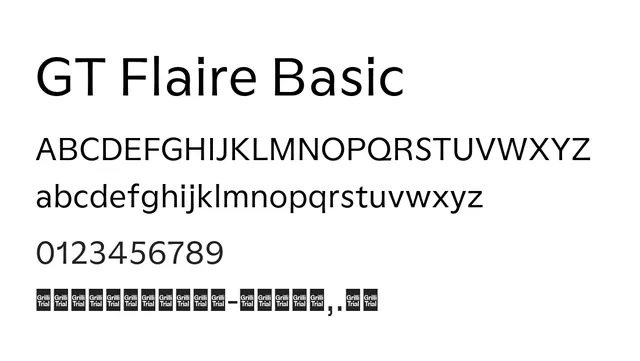
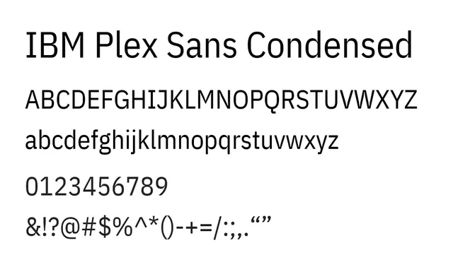
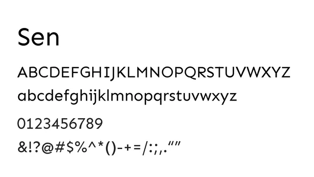
Minimalist neo-grotesque sans with clean geometry and low contrast—a versatile workhorse for UI, tech, and editorial.
Typesans-serif
Summary
Minimalist neo-grotesque sans with clean geometry and low contrast—a versatile workhorse for UI, tech, and editorial.
What to use it for
Excellent for both body text and headlines in digital and print. Works well in UI interfaces, editorial layouts, and branding systems where clarity and modernity are priorities. Readable from 11pt upward.
Pairing
Pairs excellently with serif counterparts like Lora or Merriweather for mixed editorial, or with geometric display fonts like Poppins for modern branding.