Preview image. Unlock full-res
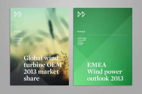
Vertical split-panel report cover with contrasting greens: light sage with wind turbine photography on the left, deep forest green with pale sans-serif headline on the right.
Summary
A vertical split-panel composition dividing information across contrasting green backgrounds: a soft green panel with photographic turbine imagery and smaller text, paired with a deep forest green panel featuring a large white headline stating "EMEA Wind power outlook 2013."
Visual description
The cover is composed as two equal halves meeting at a vertical center divider. The left panel uses a light, muted green background with a photographic wind farm image (blurred, atmospheric) and stacked text lines in small sans-serif above the lower-left corner, with a directional arrow icon in the top-left. The right panel shifts to a deeper forest green with no imagery, just a clean typographic hierarchy: a small logo/icon mark and label ("MAKE"), a few lines of smaller text, then a large display sans-serif headline ("EMEA Wind power outlook 2013") in off-white, centered vertically. Both panels share the same visual hierarchy starting point (top-left mark) and color-coordinate the typography, creating visual cohesion despite the stark background split.
Key takeaway
The efficiency of the split-panel format to house two information densities (image + body text on one side, pure headline on the other) under one unified color story. The deliberate contrast in green saturation keeps the sides distinct while staying harmonious. The typographic hierarchy scaling (small mark, small body, large headline) guides the eye predictably across both panels.
Reuse notes
Strong template for energy, sustainability, or market research reports where you want to pair documentary imagery with data-driven messaging. The split works well when the left side benefits from environmental context (photography, texture) and the right needs headline dominance. Works best with cool-toned color families.
More like this



Keep what you find
A free account saves references to boards and can send you a weekly email of picks based on what you save.
To see every result, go Pro.