Preview image. Unlock full-res
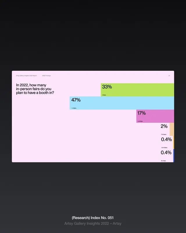
Report page showing stacked horizontal bar chart with colored segments displaying survey data about in-person fair participation.
Summary
Report page displaying a horizontal stacked bar chart visualizing survey responses about in-person art fair participation, with color-coded segments and percentage labels.
Visual description
Soft pink background with a pale card containing a survey question "In 2022, how many in-person fairs do you plan to have a booth in?" positioned on the left in dark sans-serif. On the right, five horizontal stacked bars showing responses: 47% (cyan blue, labeled "1-3 fairs"), 33% (sage green, labeled "0 fairs"), 17% (hot pink, labeled "4-6 fairs"), 2% (light peach), 0.4% (pale blue), and 0.4% (darker blue). Each segment is clearly labeled with its percentage value positioned either on or adjacent to the bar. At the top left, "2022 Findings" appears in smaller type alongside a page reference. The bottom right credits "Artsy Gallery Insights 2022 - Artsy" with a research index number. Typography is minimal and readable, with the question in a larger weight and data labels in a consistent smaller weight. The color palette uses distinct, saturated hues to differentiate each response category, creating strong visual hierarchy despite the data density.
Key takeaway
The stacked horizontal bar approach efficiently shows distribution across multiple categories with automatic percentage comparison. The color differentiation is strong and intuitive, allowing quick visual scanning. Placing the question text to the left of the chart creates a narrative flow from context to data. Percentage labels directly on or near each segment eliminate the need for a legend and reduce ambiguity.
Reuse notes
Excellent template for report pages, survey findings, market research, or comparative data sets. Works best when you have 3-6 response categories and want to emphasize how a population distributes across them. The soft pink and color palette feels approachable for gallery/arts contexts but could shift to corporate colors for B2B reports. Reserve the saturated colors for segments you want to emphasize; more muted tones work for lower-priority categories.
More like this



Keep what you find
A free account saves references to boards and can send you a weekly email of picks based on what you save.
To see every result, go Pro.