Preview image. Unlock full-res
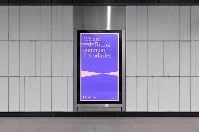
Street billboard displaying a gradient-filled poster with serif type, bright magenta-to-purple gradient, and understated logo placement.
Summary
Out-of-home poster installed in street billboard, using a smooth magenta-to-purple gradient field with centered serif headline and minimal brand lockup at base.
Visual description
Illuminated street billboard with a large poster mounted centrally in a sleek black frame. Poster interior is a smooth vertical gradient transitioning from bright magenta/pink at top to deep purple at bottom, with a subtle curved dividing line approximately two-thirds down. Centered in the upper gradient field is a multi-line serif headline in cream/light grey, reading "We are redefining common boundaries." In the lower purple section, a white serif logotype "Native" appears with small "native.inc" sub-text. The surrounding street architecture (paneled concrete wall, overhead light) is kept neutral grey to isolate the poster color field. Rigid frame lines and symmetric composition emphasize the gradient's dominance.
Key takeaway
Strong single-color gradient creates high visual impact in an outdoor environment without pattern or texture noise. Serif type in a single light weight reads clearly from distance. Curved gradient divider adds subtle dynamism while maintaining minimalist aesthetic. Ample breathing room around text lets the color field do the atmospheric work.
Reuse notes
Effective for brand or campaign posters in transit/public spaces. Gradients this bold work best on large formats where they can breathe; avoid on small screens. Serif type paired with gradient reads upscale. Works for fintech, software, or innovation-forward brands. Require high contrast at distance; test legibility with actual viewing angle/lighting.
More like this








Keep what you find
A free account saves references to boards and can send you a weekly email of picks based on what you save.
To see every result, go Pro.