Preview image. Unlock full-res
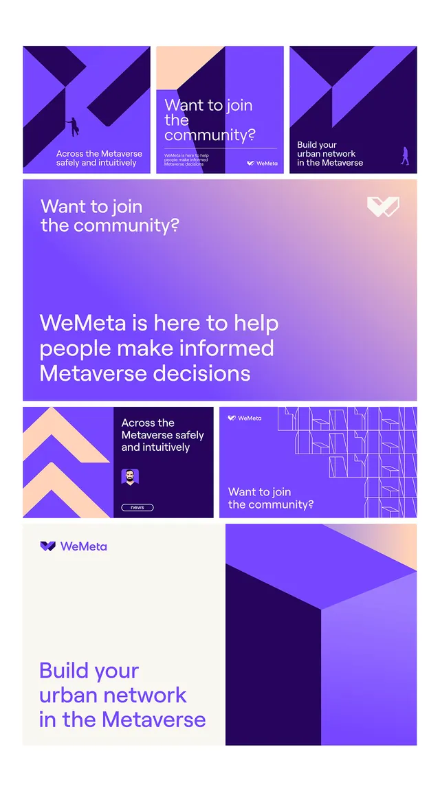
Modular grid of purple-gradient promotional cards with diagonal geometric shapes, community messaging, and a heart-logo mark, unified by violet and indigo palette.
Summary
Multi-card promotional grid for WeMeta, a metaverse community, using a unified palette of purple gradients, diagonal geometry, and sans-serif typography to drive membership and onboarding.
Visual description
A responsive card layout with five visible tiles in various sizes arranged in an asymmetric grid. Each card bears a bold diagonal stripe or chevron shape in contrasting purple tones (from deep indigo to light lavender). Text blocks ask "Want to join the community?" or "Build your urban network in the Metaverse," set in white sans-serif, with supporting copy below in a lighter purple. A heart-shaped logo with a white outline marks the WeMeta brand. The cards shift in height and position, from landscape rectangles to tall portrait blocks, creating visual rhythm while maintaining a cohesive purple-to-white color story. One card shows a stylized 3D isometric building illustration in similar purple shades.
Key takeaway
Diagonal directional shapes override static rectangles and guide the eye. A single gradient palette (light to dark purple plus white) applied flexibly across all cards unifies diverse card sizes and messaging. Geometric asymmetry feels modern without sacrificing cohesion or readability.
Reuse notes
Ideal for tech, community, or metaverse-focused brands. The modular card pattern works for multi-step campaigns, onboarding flows, or feature showcases. Scale the grid responsively; diagonal shapes act as visual signposts for CTA placement. Not suited to conservative industries; the purple palette and digital framing read young and forward-thinking.
More like this





Keep what you find
A free account saves references to boards and can send you a weekly email of picks based on what you save.
To see every result, go Pro.